Copic Sketch Marker: All About the Sketch + Why We Love Them!
What’s a Copic Sketch Marker?
Getting ready to purchase your first Copic Markers? It’s easy to be overwhelmed by all the choices— Sketch, Ciao, Classic, Wide? What’s the difference anyway? Should you go cheap? Which nib is best?
Relax.
We’re here to help you understand which marker is best for you!


What’s a Copic Sketch Marker?
Getting ready to purchase your first Copic Markers?
It’s easy to be overwhelmed by all the choices— Sketch, Ciao, Classic, Wide? What’s the difference? Should you go cheap? Which nib is best?
Relax.
We’re here to help you understand which marker is best for you!
What is a Copic Sketch Marker?
Copic Sketch Markers were designed for coloring. They are a juicy marker, making them ideal for blending and filling large areas with smooth color. The Sketch is Copic’s top selling style combining their exclusive Super Brush Nib, large ink reservoir, and a 358 color range.
Sketch Marker Overview
The Copic Sketch Marker was introduced in 1993. The Sketch is Too’s top selling marker style. They’re so ubiquitous that most people wrongly assume Sketches are the original Copic. The first Copics are actually what we now call a Classic but the Sketch with it’s improved design easily outsells the Classic.
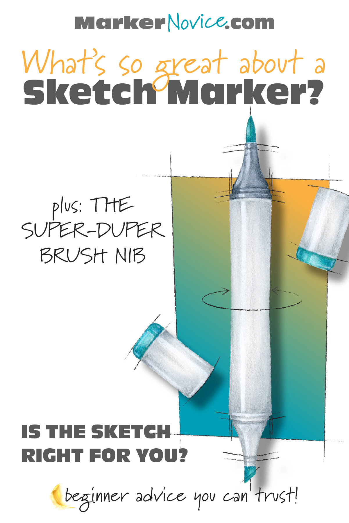
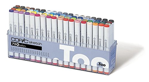
Sketches have an ergonomic flattened-oval shaped barrel which tucks nicely into your hand. It’s a slightly oversized tool which offers comfort to those with hand arthritis, carpal tunnel syndrome, tight grips, or those who color for extended periods of time.
The flattened sides keep the Sketch from rolling off your desk.
Copic Sketches are dual ended and come standard with a Super Brush Nib and a Medium Broad (chisel) Nib. A gray band indicates the brush nib end.
Sketch is the ONLY style of Copic available in ALL 358 colors.
To date, when Copic has introduced new ink colors, they’ve only offered them in the Sketch style.
If you’re someone who intends to collect every color and you will update your collection with future new releases, the Copic Sketch is your safest bet.
Sketches are refillable (further details below). The Sketch has a large ink receptacle. It holds less ink than a Classic but significantly more than a Ciao.
FUN FACT? I purchased my first Copic Markers in 1992. Yes, I’m old.
Who are Sketch Markers For?
Classic Copics (the original style) were primarily used by designers and comic, commercial, or storyboard artists. They’re an excellent drawing tool because they provide a consistent line with no bleed.
But as marker user shifted from drawing to coloring, improvements to the Classic were needed.
Sketches were developed for artists who want a juicier, more expressive stroke.
The Super Brush Nib makes all the difference.
Super Brush Nibs excel at flooding spaces with generous swaths of color. This is especially important for smooth blending where moisture is the key to best results.
Super Brush Nibs are also good for filling large areas. I frequently color images as large as 18x24” with Copic Sketch Markers.
Lettering artists and modern style calligraphers also tend to favor the Super Brush Nib. It’s a springy, reactive nib which gives an expressive multi-weight line depending upon the amount of pressure used.
Copic Sketch Markers are ill-suited for drawing, detail work, and small coloring projects.
Sketch are often overkill for card-makers using stamp images less than 3” in size.
WE ASKED! 80% of Vanilla Arts students prefer the Sketch over other Copic styles.
Copic Sketch Caps
Sketch caps match the pale gray color of the marker body.
The ends of Sketch caps feature plastic color indicators which are intended to match the ink color. A few cap colors are not exact matches but they’re close. A few color ends are translucent plastic but most are opaque; there’s no obvious reason for the translucent plastic.
Sketch colored cap ends are laser etched with the color number and name. (More on this in the next section.)
Sketch caps are interchangeable from end to end. No need to keep them straight, they’re identical.
Sketch caps feature a very secure click lock which serves as a hepatic indication that you’ve closed the marker securely. I’ve occasionally heard of Sketches drying out with the cap on but it’s so rare that I have my doubts. I’ve never personally had it happen.
I recommend that you twist the caps to remove rather than pull straight off, to prevent ink splatter.
Overall, I think Sketch caps are the best designed of all the Copic styles and they far surpass other brand caps in seal and security. The only downside to Sketch caps is that they do not nest, meaning you can’t store a Sketch cap on the opposite end while coloring. It’s a minor (but irritating) flaw.
HORIZONTAL OR VERTICAL? What’s the best way to store your Copics? Honestly? It doesn’t matter.
Copics are not gravity-fed and the ink has no sedimentary particles. This means you can store them however you’d like.

Sketch Numbering + Identification
All Copics use the same numbering system and the same refill inks.
The Copic number is laser etched in dark gray on the body of a Sketch Marker along with brand details. The color name is not listed on the barrel, only the number. Symbols indicate the brush and chisel ends.
The etched lettering does not wear off. A few of my markers are over 25 years old and they still look new.
The Copic number AND the color name are laser etched on the end of both caps.
Black etching on pale colors and white etching on dark colors.
Because the numbers are etched on the end of the cap, it’s easy to select Sketch markers from upright storage. This is a definite advantage over the Ciao and Wide marker styles which have no end-cap markings.
A thin, darker gray band indicates the brush nib end. The band is on the marker body, not the cap.

Sketch Nib Options
Copic makes a variety of replacement nibs for all of their markers. Nibs do wear out and can get damaged but they’re easily replaceable.
WARNING: Dried, crusted, or hardened nibs can be replaced BUT the nib is not the only part damaged when a marker runs dry. The core inside the marker is made of a similar material and often hardens along with the nib. A nib can be replaced but you can not replace a core. A damaged core requires full marker replacement.
Serious Copic users often install alternative nibs to upgrade their marker for specific tasks.
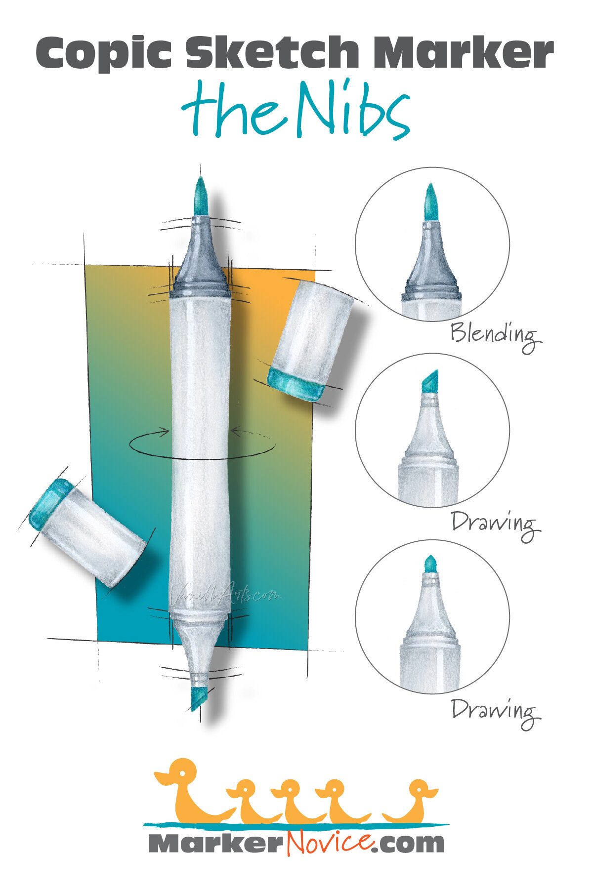
Sketch Standard Nib 1: Super Brush Nib. (Do not confuse the Super Brush with the Copic Round Brush Nib which fits Classic Markers only.)
The Super Brush Nib is an extremely juicy and springy nib which responds to changes in hand pressure. S.B. nibs excel at blending and filling larger areas because they deliver more ink to the paper than any other Copic nib.
The S.B. nib rests in the dark gray end of the marker.
WARNING: When refilling a Copic Sketch, I recommend you do not refill from the brush end (more details in the refill section below).
Sketch Standard Nib 2: Medium Broad Nib (chisel)
Copic users almost always refer to this as the “chisel nib” and many colorers ignore this nib entirely.
Chisel nibs are an old-school drawing nib capable of 3 different line weights. Chisel nibs are not generous with their ink flow and thus are not suitable for blending. Chisels are very firm and need to be broken in (softened a bit) before they give an even line with no skips or flow breaks.
The Chisel nib rests in the pale gray end of the marker.
I recommend refilling from the chisel end for ease and safety (more details in the section below).
Sketch Replacement Nib Option: Sketch Fine Point (bullet)
Ideal for lettering and detail coloring, the Sketch Fine Point is a firm bullet nib which provides maximum control, even ink flow, a fine line, and is perfect for small-ish details. This nib is designed to replace the Chisel nib and fits on the light gray end of the Sketch marker.
I recommend that card-makers and small stamp colorers switch to the fine nib on their most used colors (replacing all your chisel nibs can be costly). The fine nib is designed to replace the Chisel nib and fits on the light gray end of the Sketch marker.
WARNING: Copic makes more than a dozen different replacement nibs. The three listed here are the ONLY nibs which fit in Copic Sketch Markers.
BEST BUY? Consider purchasing a used Copic collection. Properly maintained Copics look and work like new!
Refill a Sketch Marker
All styles of Copic use the same numbering system and the same refill inks. See the full Sketch color palette at Copic’s official website here.
A factory-weight Copic Sketch Marker should measure between 14.5 and 14.8 grams (with both caps on). See the end of this section for an update on factory weight info.
I do not recommend filling to factory weight as completely full markers are more prone to Copic Volcanoes (see my article at VanillaArts.com about volcanoes.)
Like all Copic markers, performance decreases and blending becomes more difficult as the marker empties. Noticeable blending changes begin at about 13.5 grams and you will encounter blending impairment at weights lower than 13.2 grams. This can be as few as 2-3 uses for your most-used colors!
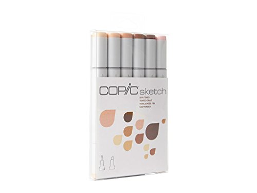
It is a myth that Copics can go for years without refilling. The first thing I check when a student can’t blend well is their marker weight. I’ve seen markers as low as 11 grams! Read my article about common Copic Myths here and read details about Blending Issues at our sister site, VanillaArts.com.
Overfilling leads to marker leakage.
For accuracy, I recommend refilling by weight rather than the drip method. I find most drop recommendations to be wildly wrong. “10 to 12 drops” doesn’t tell you the size of the drop or how low the marker was to begin with. In my tests, 10 drops doesn’t come close to restoring an ideal weight.
See my refilling recommendations at VanillaArts.com which includes a link to a great weight refilling tutorial by Michelle Houghton from Copic in the Craft Room.
WARNING: To refill efficiently, you should remove one nib from your Sketch marker. I do not recommend removing the Super Brush Nib as this can easily damage the brush nib. Copic Tweezers are meant to reduce brush nib damage but it’s much safer and far easier to refill from the chisel end.
__________
* UPDATE (December 2022): I’ve been hearing from readers/students that brand new Copic Sketch are now weighing closer to 14g. I reached out to Elena at Violeta-Ink.com and she confirms that the average weight of her fresh stock is more like 14.2g rather than the 14.6 average that I observed back in 2018. Has Copic has reduced the starter weight as a cost savings measure? We’ll keep watching to see!


CHECK FIRST! Beginners often mistakenly purchase Classics because they look similar to Sketch online. AVOID CLASSICS IF YOU WANT TO BLEND!
Personal Thoughts:
My first Copics were Classics because Sketch had not been invented yet. I used them for drawing and hand-lettering. In 1994, I sold my 46 Classics and gradually replaced them with Sketches. It took me a decade to complete my current collection. I do not own the T or F families and will likely never buy them.
I use Sketch exclusively and I recommend them to all my artistic coloring students.

The Super Brush Nib requires some bravery and training but it’s relatively easy to master and produces beautiful effects.
Sketch are the most expensive style and many people try to save money with Ciao. Ciao have drawbacks though— the caps do not have color numbers, the caps have a design flaw which can damage your nib, Ciao must be refilled frequently, and they seem to be more prone to leakage and volcanoes.
Additionally Ciao is only available in 180 of the 358 total colors. Many of my favorite colors are Sketch only. Buying Ciao means that by necessity, you will have a mixed collection which frankly, is hard to store and display.
I recommend Sketch over Ciao because of the larger Sketch color range and I really dislike the Ciao caps.
I recommend Sketch over Classics because of the Super Brush Nib.
I think Sketch are the best value Copic over a lifetime of use.

Amy Shulke is a professional technical illustrator who has used Copic Markers at school, work, and home since 1990. She teaches artistic coloring classes online at VanillaArts.com and locally in south-eastern Michigan.
Marker Novice is Amy’s completely free resource devoted to beginner marker education. For intermediate/advanced artistic coloring articles, see her Studio Journal here.












Click to receive Marker Novice & Vanilla updates in your Pinterest feed



Copic Markers: What’s the Difference between Black 100 and Special Black 110?
“Which black marker should I start with?”
It’s a common question for beginners— because honestly, it’s very hard to tell the difference. But even with experience, people wonder, “Am I using the correct one? Do I even need the other black?”
What’s the difference between Copic Black 100 and Special Black 110?
My answer might not be what you expect…


“Which black Copic Marker should I buy first?”
This is a common question for beginners— because if you’re looking at online swatches, it’s hard to tell the difference between Black 100 and Black 110.
But I also get a similar question from experienced Copic users.
People often wonder, “Am I using the correct black? When should I use Black and when should I use Special Black?”
What’s the difference between Copic Black 100 and Special Black 110?
My answer might not be what you expect.
100 Versus 110
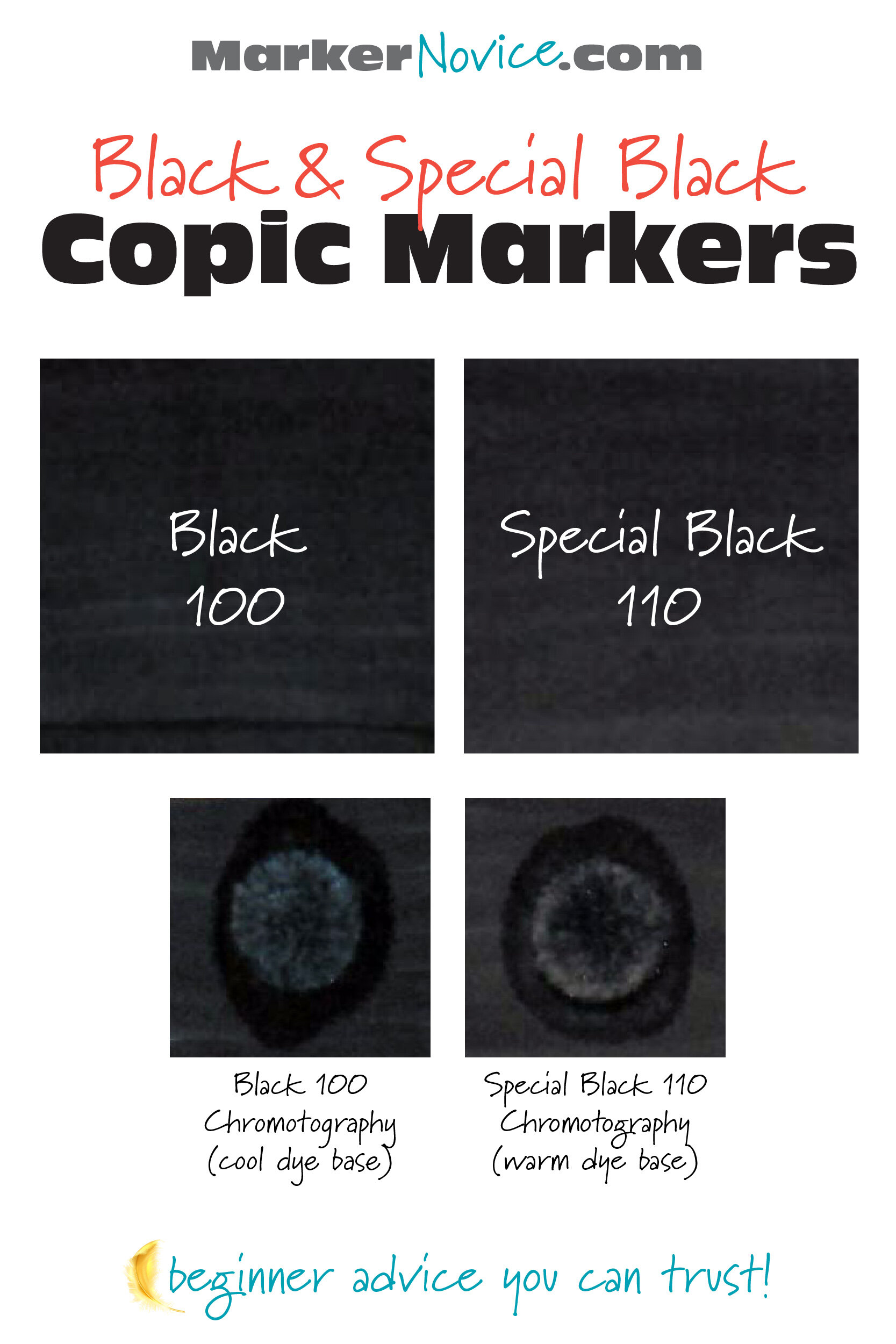
Copic Marker makes two subtly different black markers. Black 100 is a cool black. Special Black 110 is a warm black. The difference is only apparent when the inks are placed side by side.
Which black Copic Marker is best for beginners? Let’s find out!
First, A Word About Copic Ink…
The fact that we’re calling it Copic Ink means we have some explaining to do.
Copic Ink is actually dye.
In art mediums, it’s important to understand the difference between dyes and pigments.
Why? Because this is critical to understanding how your Copic Markers behave.
I’m not going to go deep on dye versus pigment but here’s a quick summary:
Pigments are:
Finely ground minerals, metals, or other substances
Must be used with a binder (pigments will not adhere to paper or canvas without help from “glue”)
Not soluble in water, alcohol, or other solvents
Tend to be lightfast
Opaque
Used in paints, colored pencils, pastels, glazes
Dyes are:
Microscopic molecules of colorant
Soluble in water, alcohol, or other solvents
Sink into the paper and stain the fibers rather than sit on the surface
Not lightfast (often “fugitive”— meaning it will fade over time, even in a dark drawer!)
Transparent (due to extremely small particle size)
Used in pens, markers, and calligraphy dip-pen inks. Also is a primary component of craft-grade and student-grade art supplies
Copic Ink is dye.
You must always keep in mind that you’re dealing with a dye that’s transparent and absolutely NOT lightfast.
The other drawback to dye is that a truly black dye does not exist.
There are many black pigments but if you want black dye, you have to mix a bunch of colors to create a dark color which looks black-ish.
Black dye really just an intense mixture of something blue plus something magenta with other colors thrown in for good luck.
The Copic may say Black 100 or Special Black 110 on the cap but neither marker is actually black.
And that’s the key:
The difference between black 100 and 110 is all about the mixture.

Copic Black 100
Copic’s Black 100 is made with a base of blue dye.
There are other colors in the mix but the highest percentage is blue.

The heavy blue concentration is why Black 100 feels slightly cool in temperature. Copic 100 works very well with the C series of Cool Gray Copics.
In the Copic Numbering System, think of 100 as C11.
The coolness of 100 is amplified by some papers.
The blue notes are most noticeable when you single-coat the area with just one layer of ink. It’s much less obvious if you build the layers, using 2-3 coats of 100.

Special Black 110
Copic’s Special Black 110 is made with a base of magenta and green dye.

110 is not as noticeably warm as the Black 100 is cool. There is a slightly pinkish sheen to Special Black if viewed wet, under a lamp, with the paper tilted at an angle. The warmth is much less obvious when the ink is dry.
In the Copic Numbering System, think of 110 as T11.
The warmth of 110 is amplified by some papers.
The warm notes are most noticeable when wet. It’s also more pronounced when you single-coat the area with just one layer of ink. It’s much less obvious if you use 2-3 coats of 110.
Side By Side: Black Copic Comparison
I’m going to be honest here:
There is a difference between 100 and 110— but don’t worry about it.
You have to place the colors side by side in order to really see the distinction.
I can’t think of a single project in my entire 30 year career where I’ve used both blacks together. I always use one or the other, never both.
Side by side, 100 looks a little cooler. Side by side, 110 looks a little warmer. But it’s not a major difference, even when you’re deliberately looking for the differences.
I’m pretty sensitive to color…
I’m one of the few people who actually enjoys figuring out which colors an artist used and why…
I hyper-analyze stuff for fun…
But even I’m not enough of a color nerd to immediately notice which black you’re using in random projects.
#100 and #110 are both basically black.
The Myth of “Darker”
Okay, I’m about to get nerdy on you. But I warned ya!
If you Google “What’s the difference between Black and Special Black?” you’re going to get several results which say 100 is darker than 110.
I disagree.
I think both blacks are the similar in value. Neither is significantly “darker” or “deeper” than the other.
I think it’s an optical illusion.
Color temperature is important to the human eye and brain.
We use subtle shifts in color temperature to gauge distance and depth.
Cool colors recede. As objects get farther away from us, they appear more muted and generally cooler.
Warm colors feel closer. Objects that are close to us feel more saturated and generally warmer.
I think this is what’s happening when people compare Black 100 and Special Black 110 side by side.
110 is warmer, therefore it feels closer and brighter. 100 is cooler and feels farther away. If you do a single coat of each color, Special Black jumps forward and yells “Hello!” while 100 kinda waits for you to notice her.
You’ll see similar color temperature discussions with painting blue skies in color theory classes. Green-shift blues simply do not recede into the distance the way red-shift blues do. It makes a difference in painting landscapes and I don’t see why this same difference isn’t as obvious to people with black Copic Markers.
People are misinterpreting 100’s cool distance for “darkness”.
Which Black Copic is best for beginners?
The answer is simpler than you’d expect:
It doesn’t matter.
If you buy a boxed set, use whichever black which comes in the set. Don’t even bother buying the other one.
If you don’t have either black, buy the black that’s on sale.
As I said earlier, the difference is only noticable when you place the blacks side by side— and I’ve NEVER used both blacks in the same project.
I didn’t own both blacks until maybe 2017? I had access to both at the office and I still didn’t use both.
It didn’t kill me.
And in teaching? All of my class supply lists say:
Black 100 or Special Black 110, either will work
Why a “Special” Black?
I’ve heard students talk about a Gray Rule for Copics.
If the object you color is a living thing, use warm gray. Warm grays add life.
If the object you color is not living, use a cool gray.
But I’m a complete over-thinker. What about a blue whale? He’s cool and he’s also alive. What about an antique silver spoon? It’s not living but it’s a warm version of silver. And please tell me, is a wooden table alive or dead?
It’s made of wood, wood was once alive but now it’s dead?See? Now we’re having stupid debates about whether wood is alive when all we wanted to do was use a simple gray marker.
I know. I’m sorry. I was born to poke holes in dumb rules.
Anyway, back to black…
Is there maybe a black rule too?
It could be something like: Use Black 100 with cool grays but switch to Special Black 110 when using warm?
Is that why Copic introduced a secondary, “special” black?
And if so, what black should we use with the neutral grays?
Nope.
Special Black was never meant for you. Black 110 belongs to the people in the print industry.
Remember, Copics were originally developed as a tool for commercial artists, graphic illustrators, and designers.
In this article, we’ve only addressed the way the two black markers physically look in real life, in person, right in front of your face.
Commercial artists on the other hand, do not sell original marker art; we make art and illustrations for print media. Everything we draw is designed to be photographed or scanned, then printed for mass distribution.
Cameras and scanners are different than the human eye. Mechanical lenses sense color differently. If you’re working in grayscale for print media, you don’t want to risk your black looking weirdly blue.
Especially not back in the days before Photoshop.
This is why the Toner (T) Grays and Special Black exist. They’re a consistent grayscale required for reliable accuracy in print reproduction of commercial art.
It’s a relic left over from a time before many of you were born.
Back in the dinosaur days when we did everything by hand, we needed stuff like Special Black.
Now we don’t.
I Don’t Use Black!
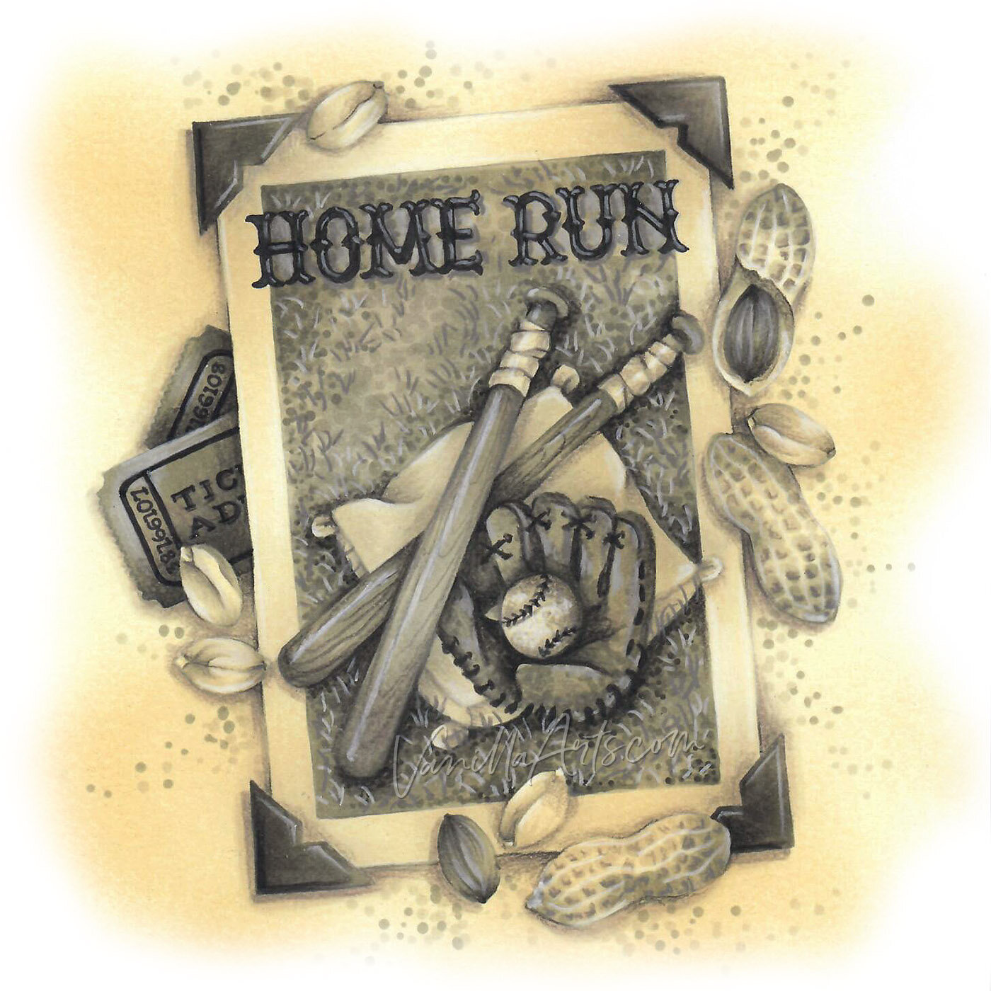
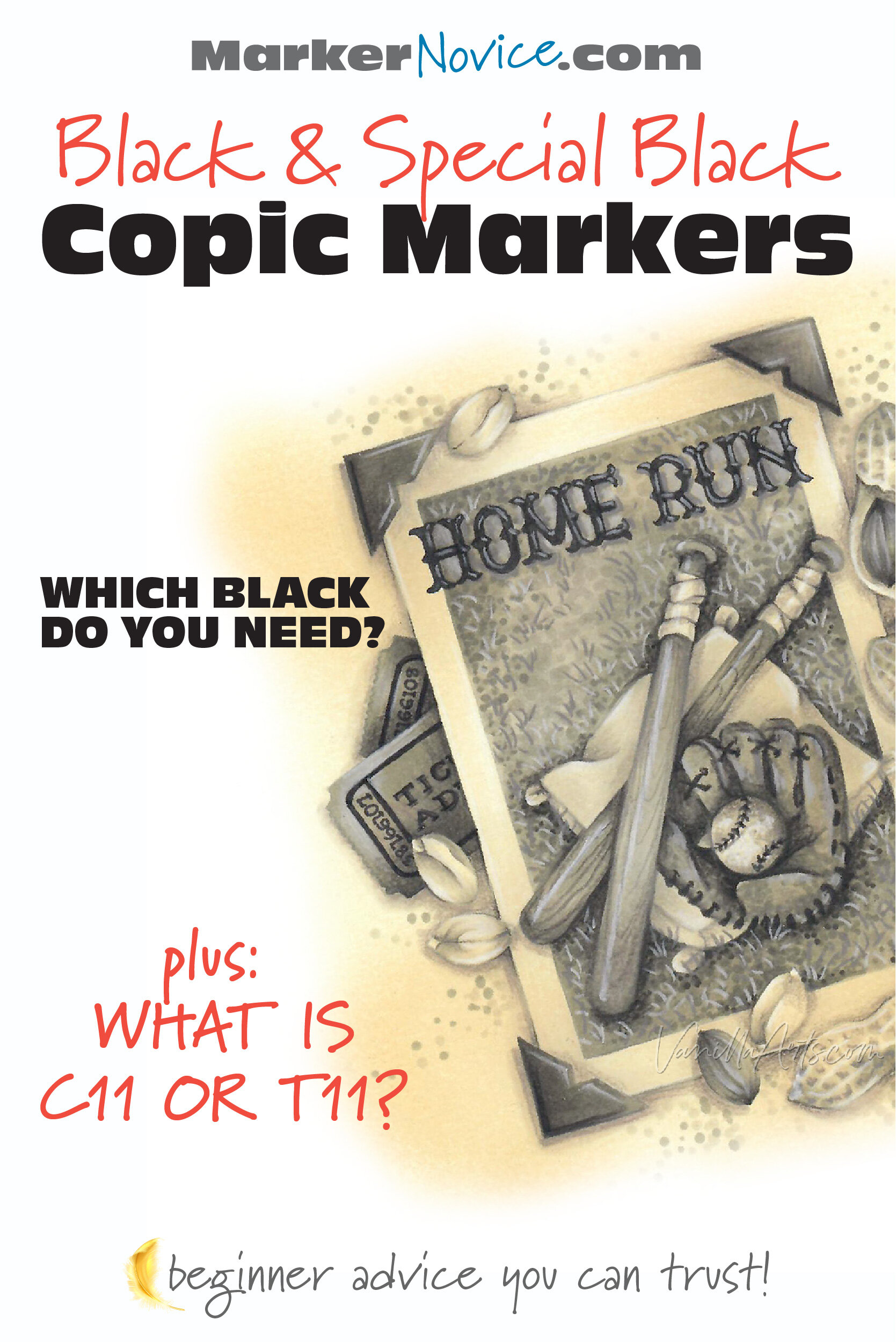
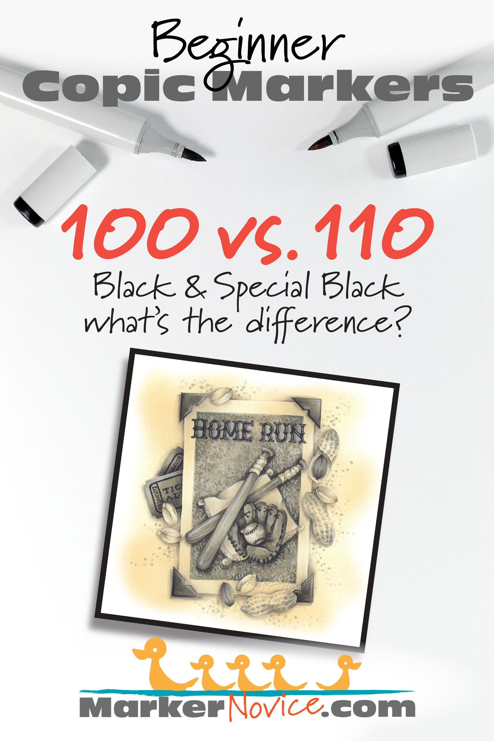
Confession time. The Home Run project you see here?
There’s no black Copic in it.
I colored this with a range of Warm Gray Copics. It’s W2, W4, W6, and W8.
No black!
Frankly, I don’t use black much. I can layer and create richer and prettier blacks than either 100 or 11o.
Besides, black is depth killer. How do you shade something that’s already black?
If you understand how to manage values, you don’t need Black or Special Black.
The darkest marker I use is the occasional hit of C9.
I have black on my starter kit list ONLY because I know people will want it at Halloween. Most of the year, my blacks sit untouched and unloved… I use them to label boxes more than coloring.
The dirty truth is that you don’t really need EITHER black.
If you purchase a Copic Gray set, you’re better off with the Gray #10 that comes in the set. Your art will be more creative and visually dynamic for it.
For further information about black-free coloring:
I’ve got a free video at YouTube that talks about why I avoid using black.
And I’ve got a full article about the Dangers of Black at my primary site, VanillaArts.com.
Should You purchase Copic 100 or 110?
Get whatever’s on sale and don’t worry about buying the other. You’ll never use both on the same project and that’s the only time anyone would ever notice a difference.

The difference between Copic Black 100 and Special Black 110 is very subtle. 100 is cooler and 110 is slightly warm.
But with 2-3 coats of either black and after the ink has dried, the color difference is almost imperceptible.
Both markers will fit in fine with anything you color.
Save money: skip one of the blacks.
Amy Shulke is a professional illustrator who has used Copic Markers since 1990. She teaches artistic coloring classes online at VanillaArts.com and locally in south-eastern Michigan.
Marker Novice is Amy’s completely free resource devoted to beginner marker education. For intermediate/advanced artistic coloring articles, see her Studio Journal here.

Click to receive Marker Novice & Vanilla updates in your Pinterest feed


The Copic Numbering system: How to Read Your Marker Caps
Everyone hears about the mysterious Copic Marker number code. Every Copic 101 blog or video tries to unlock the riddle for you. And yet the standard explanation always leaves me more confuddled than before.
How does the Copic Numbering System REALLY work?
The truth is probably different than what you’ve been taught.


You’ve heard about the mysterious Copic Marker number code.
Many blogs and beginner Copic videos try to explain the code… but the standard explanation always leaves me more confused than before.
How does the Copic Numbering System REALLY work?
The truth is different than what you’ve read.
Copic’s Numbering System
The Copic Numbering System describes an ink classification rather than a color. The letter indicates the color family. The first number designates a mother ink formula. The final number tells the color value. Understanding the code makes blending easier by helping you select similar markers to use in combination.
My explanation is probably different than what you’ve read before.
Let’s look at why.
First: Forget What You’ve Been Told!
I’ve heard so many people explain the numbering system wrong.
Part of the problem is Copic keeps changing their explanation.
Copic (Too) is a Japanese company. For decades, they’ve relied upon distributors to educate customers in their native language.
When I received my first Copic chart back in the early 1990’s the Numbering System explanation made sense.
But over the years, Copic distributors tried to simplify the answer. Then they simplified the simplification, then they did it again. We’re at the point now where the current explanation is unrecognizable to many experienced Copic artists.
Frankly, the explanation on the official Copic website is just plain WRONG.
Why is it wrong? Because they incorrectly define the word “saturation”. Words have meanings and saturation is not as they describe.
The other reason why I want you to forget what you’ve heard: the person who taught you was likely taught by someone else who was taught by someone else…
It’s like a game of telephone.
Everyone just repeats what they think they heard. Now it’s all garbled.
The standard explanation does not make sense because it incorrectly uses the words “saturation”, “value”, and “vibrancy”. Many crafters miss the discrepancy but anyone who has taken color theory classes wonders “What???”
The Letter: Color Family
This is the part I don’t quibble with. It’s pretty straight forward:
Copic groups all related colors into specific color families.
Copic Families

R = Red
YR = Yellow Red (orange)
Y = Yellow
YG = Yellow Green (warm greens)
G = Green (cool greens)
BG = Blue Green (aqua and turquoise)
B = Blue
BV = Blue Violet (violets which lean strongly towards blue)
V = Violet (most read as warmer purple)
RV = Red Violet (magenta)
E = Earth (browns ranging from warm to cool)
N = Neutral Gray
C = Cool Gray
W = Warm Gray
T = Toner Gray (slightly warm, matches copy machine toner)
F = Florescent (8 specialty highlighter type colors, not related by color)
Colorless Blender (#0) and the two blacks (#100 and #110) are the exceptions to the rule. These three markers do not carry a letter in their code.
Combination Letters?
Here’s a tidbit nobody ever explains well.
Ever wonder why they call it YR instead of O for orange or why it’s RV instead of M for magenta or P for pink?
Copic is telling you a secret: Combination letters are actually combination inks.
YR inks are not orange inks. It’s a mix of Y ink and R ink. The effect is orange but the ingredients are Y and R.
RV inks are not pink inks. It’s a blend of something R mixed with something V.

Why is this good to know?
BV23 is a combination ink; it’s a mixture of blue ink (B) and violet ink (V). They literally mixed two inks to make this color of blue-violet.
This is important because ink combinations are less stable than single inks.
Under the right conditions, you can accidentally shatter the ink combination.
If you use lots of colorless blender (or a marker with a high colorless blender content) next to BV23, you’ll see hints of pink and some warmer blue leaking out around the edges of BV23. It’s actually very pretty but if you’re trying to blend or want something with a clean edge, you really don’t want pink leakage.
As an artist, when I’m feeling playful, I deliberately choose combination inks but I avoid easy-to-shatter markers when teaching beginners to blend.
(Link leads to the recommended supply page on our main site, VanillaArts.com. We keep one list for both sites to insure the links and buying tips are current.)
First Number: The Mother Ink
Okay, here’s where the old literature is better than new Copic charts.
Current literature and many instructors calls the first number a Blending Group.
The first number is absolutely not a blending group because Copics were developed 20 years before marker blending was invented.
You’ll see the first number described as “saturation”. I’ve heard many people explain that as the first number goes up, the colors get muddier or grayer.
This is NOT true!
The YR20 series is a warm brassy set of golds. They’re not the least bit gray. The Y30’s are saturated and bright while the Y20’s are a little dingy. This is the opposite of what today’s instructors tell you.
(Remember, many “instructors” are simply good colorers rather than trained artists who understand applied color theory.)
The B60 series is clean periwinkle. In fact, B69 and B79 are textbook definitions of saturated color. They’re not dirty colors and yet they sit between blue-gray B40’s and slightly blackened B90’s.
(Again, this negates the idea that the higher the first number, the less saturated the color.)
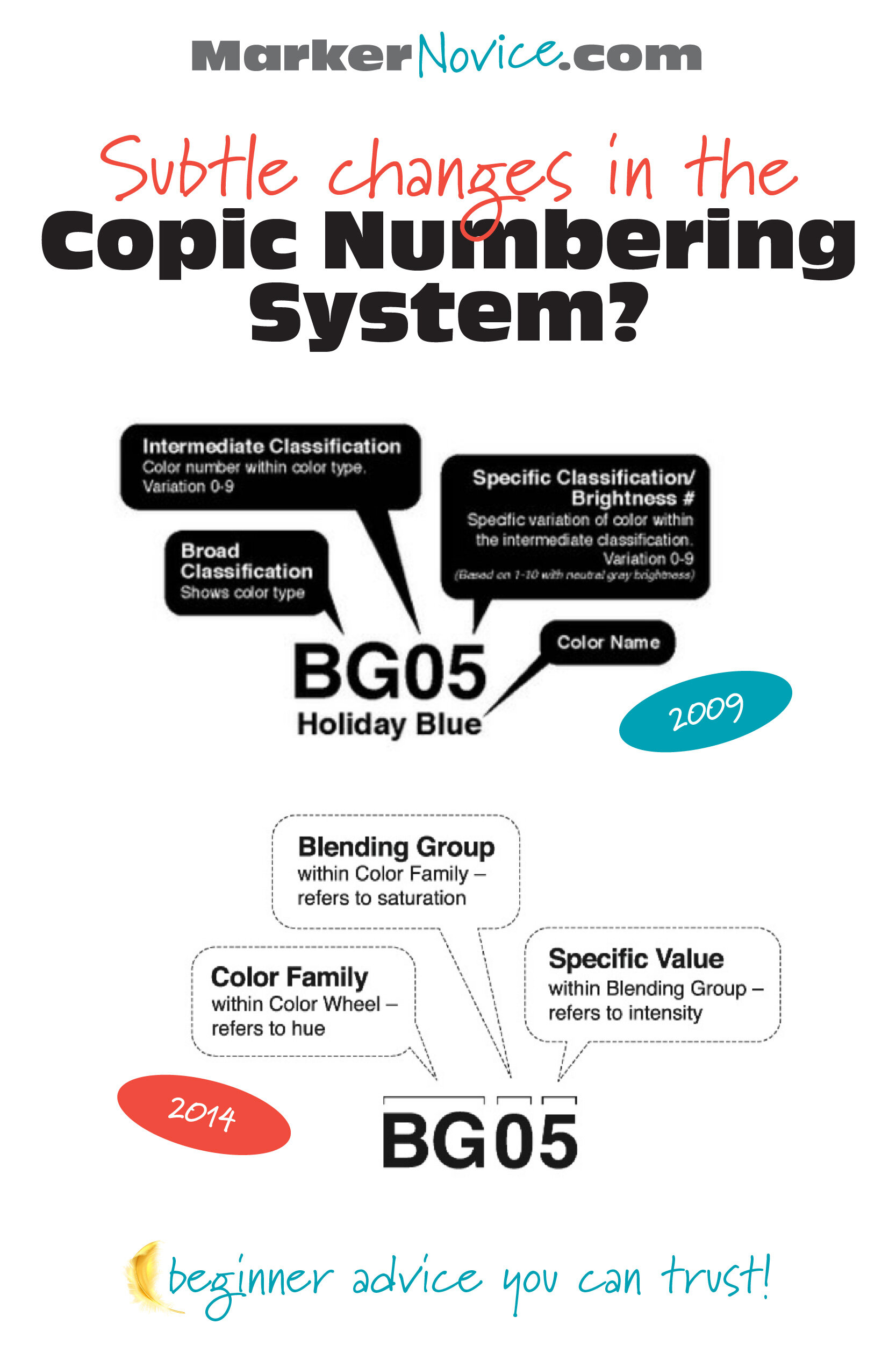
“The higher the first number, the less saturated the color” sounds completely logical until you physically look at the markers. The rule fails in every color family!
So what’s really going on?
If we go back to the old literature, there’s a clue. The first number was formerly called an “Intermediate Classification”. You can see the 2009 explanation compared to the 2014 explanation here.
In the 2009 version, look at the details below “Intermediate Classification”…
What’s a “Color Type”?
Copic uses the first number to tell us the Mother Ink.
The Mother Ink gives birth to every marker in a color series.
Let’s say Copic has a dark red ink. They call it Red Ink #2. Red #2 is a mother ink.
They use this Red #2 mother to produce a dark red marker called R29. They keep using this mother to then create more dilutions of the same color— R27, R24, R22, R21, and R20. If they wanted to invent a new marker, like R25, R23, or even R28.5, they’d start with the mother, Red #2.
Blue #9 is used to produce B99, B97, B95, B93, and B91. The number 9 has nothing to do with saturation. #9 is the 9th blue series, 9 is the designation for the Mother Ink.
The first number tells you the ink genealogy. It’s a recipe guide.
This is why you’ll hear instructors talk about Natural Blending Groups. A natural blend would be 2-3 markers (or more) that all share the same Mother.
Natural Blending Groups blend very easily because chemically, they’re siblings. They share a Mother recipe, so they practically blend themselves on contact.
BEST BEGINNER ADVICE: Pay attention to the Mother numbers! Buy your markers in sets or trios that share a first number and you’ll always have easy-blending combinations. It’s not magic, it’s chemistry!
Last Number: Value (kinda-maybe-sorta)
The last number is what gets mangled all the time!
Want to hear something funny?
The last number ACTUALLY indicates color saturation.
People yammer about saturation for the first number when it’s really the second number that’s all about saturation!
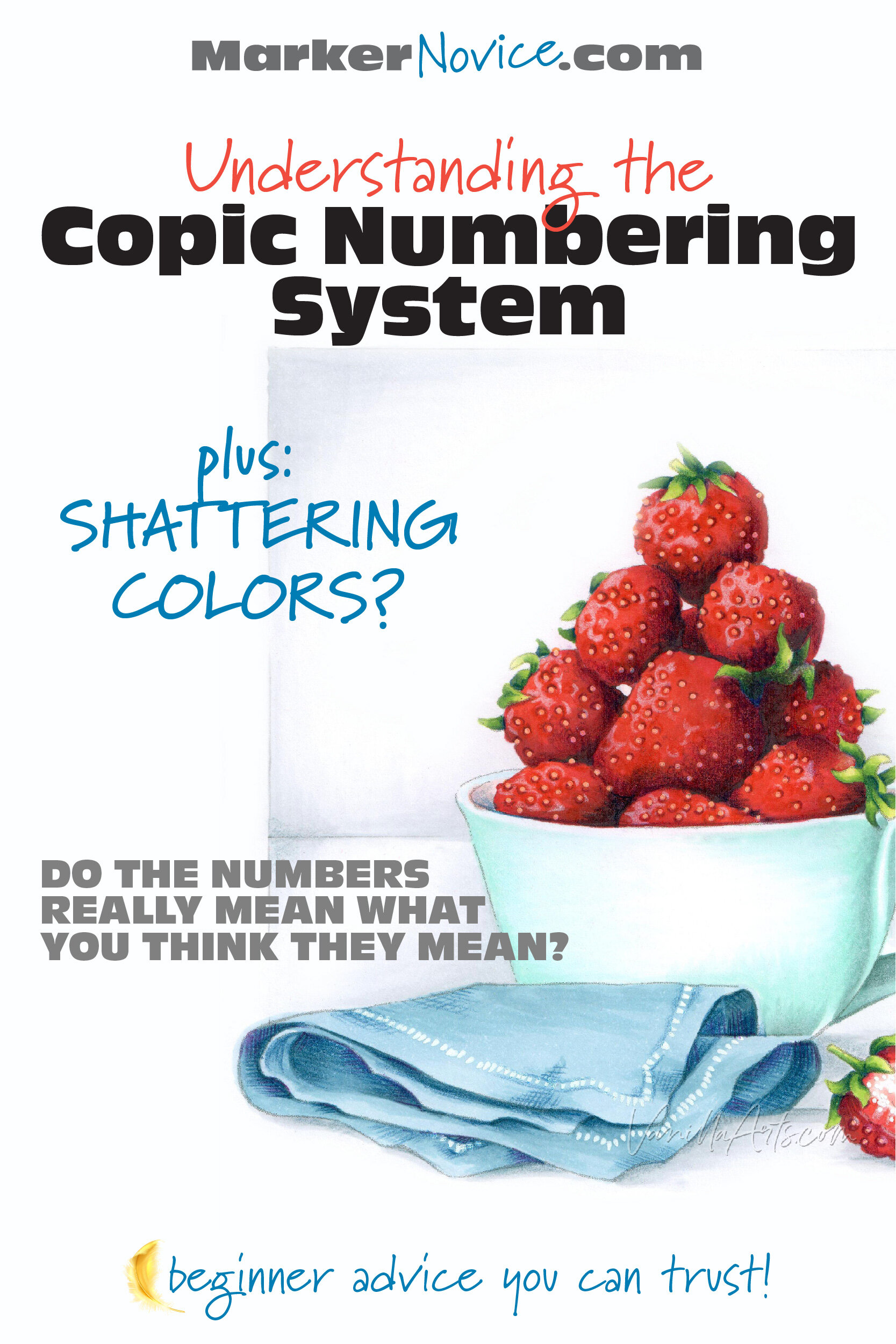
Saturation is the purity of a color. Reach up into a rainbow and grab a hand-full of pure saturated color. Now add anything to that rainbow-saturated color and you start to DE-saturate it.
You can desaturate color with gray or black but you can also desaturate with white. Pink is a desaturated version of saturated magenta.
In the case of Copic, they desaturate with Colorless Blender.
Start with a B29 Mother Ink and add a little Colorless Blender. You just made B28. Now add more Colorless Blender and you’ve made B27 or B26. As the last number gets lower, the color gets less and less saturated.
So why did I say the last number was value?
Because Copic doesn’t just splash Colorless Blender into the recipes willy-nilly. They measure the color very carefully on a value scale.
Which value scale?
The fine print on the old, old, old charts tells us that Copic uses their Neutral Gray markers to measure the value of ALL OTHER COPIC MARKERS.
Yes, that’s a fact worth yelling about.
So the value of an N5 is equal to the value of B05, Y95, V15, R85, and even Y35. They are all a value level 5!
I’ve written more about Copic values at my main site VanillaArts.com. The article includes an interesting brain-test for you. How accurately do you see values?
But wait…
I said the last number equals value but in a “kinda-maybe-sorta” way. Why did I use weasel words?

Well, Copic is a little weird. They measure value accurately but they do it completely backwards.
In other art mediums and every color theory class all around the world, pure black is a low level zero and pure white is a high level ten.
In Copic, the blacks are HIGH and the whites are LOW.
Copic could’ve made it sooooo easy… but no.
BEST BEGINNER ADVICE: As you choose blending combinations, avoid choosing markers with the same last numbers. If the last numbers are the same, you’re not getting any lighter or darker. The most attractive blends skip 2-3 value digits in the last number. Try B99, BG57, BG53, it’s gorgeous!
What Mother Ink are the 00’s From?
Honestly? I’m not sure.
00’s, in theory, should be from the #zero Mother Ink but there are always a few aughts that feel odd to me.
Take the Gs for instance. G03 and G07 (Mother Ink = Zero) are very classic grassy greens. But G000 and G0000 seem very blue.
The Rs also feel funky. R08, R05, R02, and R01 are all warm light-reds but R00, R000, and R0000 have a cool cast. That doesn’t fit.
My personal theory is that the double, triple, and quad zero markers are all unstable. These markers contain a ton of Colorless Blender. It’s the equivalent of you bathing in bleach. When the solvent levels get crazy-high, the colors skew weird.
Why Aren’t Copic Numbers Sequential?
Great question!
The gaps in the numbering system are reserved for future marker colors.
They don’t make a YR87 yet. When they finally get around to it, there is a logical space waiting for it.
Copic would start with the YR#8 Mother Ink and add colorless blender until it measures a 7 on the Copic Neutral Gray Scale.
See? It’s chemistry!
Gray Numbering
Why do grays only have one number?
Because for grays, the letter is not the color family.
GRAY is the color family.
N, C, W, & T are the Mother Ink.
Then the single number is the value.
Get it?
What About Names?
Ignore them.
I use YG03 on a daily basis and I have no clue what the name is.
Copic people don’t use Copic names.
pssstttt… YG03 is “Yellow Green”. Nope, I’ll never remember that.
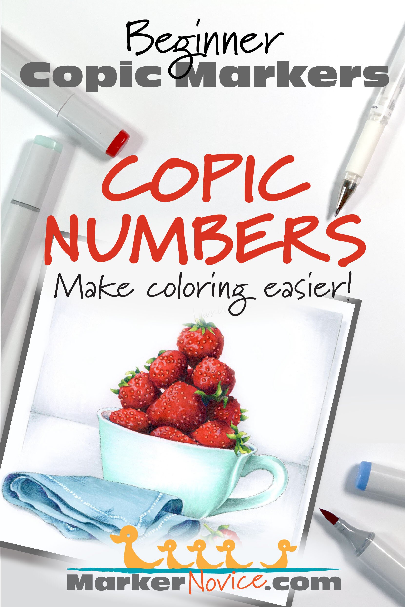
How do I Pronounce the Copic Number code?
Okay, someone out there started making a big deal about this. It almost sounds snooty when they over-annunciate every individual number.
“Always say B. THREE. FOUR! Never say B-thirty-four.”
Wanna know what? I really don’t care.
I picked up my first Copic in 1990 and EVERYONE in the entire graphics department said “thirty-four”.
I never heard “three-four” until it hit the internet a couple years ago.
I took Copic certification and everyone said thirty-four, even the instructor who had been working for Copic for over a decade.
It’s dumb.
We’re all adults. You can quickly translate numbers without waggling your finger at yokels like me who say thirty-four.
There you go!
Everything you need to know about the Copic Numbering System…
plus a little bit more.
Just remember:
Copic Numbering tells you about the ink formula, not the ink color.
The letter indicates the color family
The first number is the Mother Ink
The second number is the value (kinda)
The numbering is the best part about Copic Markers for beginners.
The numbers make it easy to pick blending combinations and to predict how colors will look and how blends will behave.
I know it’s tempting to grab markers based on the plastic cap color but it’s wise to start learning the numbering system instead. With twenty-five (oops, Two-Five) years of experience, I still use the numbers daily.
It’s a skill you’ll never outgrow.
Amy Shulke is a professional illustrator who has used Copic Markers since 1990. She teaches artistic coloring classes online at VanillaArts.com.
Marker Novice is Amy’s completely free resource devoted to beginner marker education. For intermediate/advanced artistic coloring articles, see her Studio Journal here.

Click to receive Marker Novice & Vanilla updates in your Pinterest feed

Copic Markers: How Many Colors Does Copic Make? (Beware!)
“Why is it impossible to find some Copic Marker colors?” a student asked recently. She’s been waiting for years on some colors. Years? That’s weird. Shelves are pretty flush right now; what can’t she find?
Then it hit me— her Copic chart doesn’t match her favorite marker style.
She’s looking for Copics which do not exist.
So let’s clear this up, before you get confused too…


“Why is it impossible to find some Copic Marker colors?”
A student asked me this recently. She’s been waiting for years on some colors.
Years?
It’s an odd question because while Copic stock varies from store to store, in general, shelves are pretty flush right now. And if you shop online, you can easily buy them all. So what colors can’t she find?
Then it hit me— her Copic chart doesn’t match her Ciao style markers.
She’s been looking for markers Copic doesn’t make.
So let’s clear this up, before you get confused too.
How many colors does Copic make?
In the Classic, Ciao, or Wide style? It may be less than you think.
Copic Makes 358 colors
Copic Inks come in 358 different colors BUT not every color is available in every style of Copic Marker. Copic offers a limited color range in their less popular marker types:
Refills: 358 colors (available in every color)
Sketch: 358 colors (available in every color)
Classic: only 214 colors
Ciao: only 180 colors
Wide: zero colors
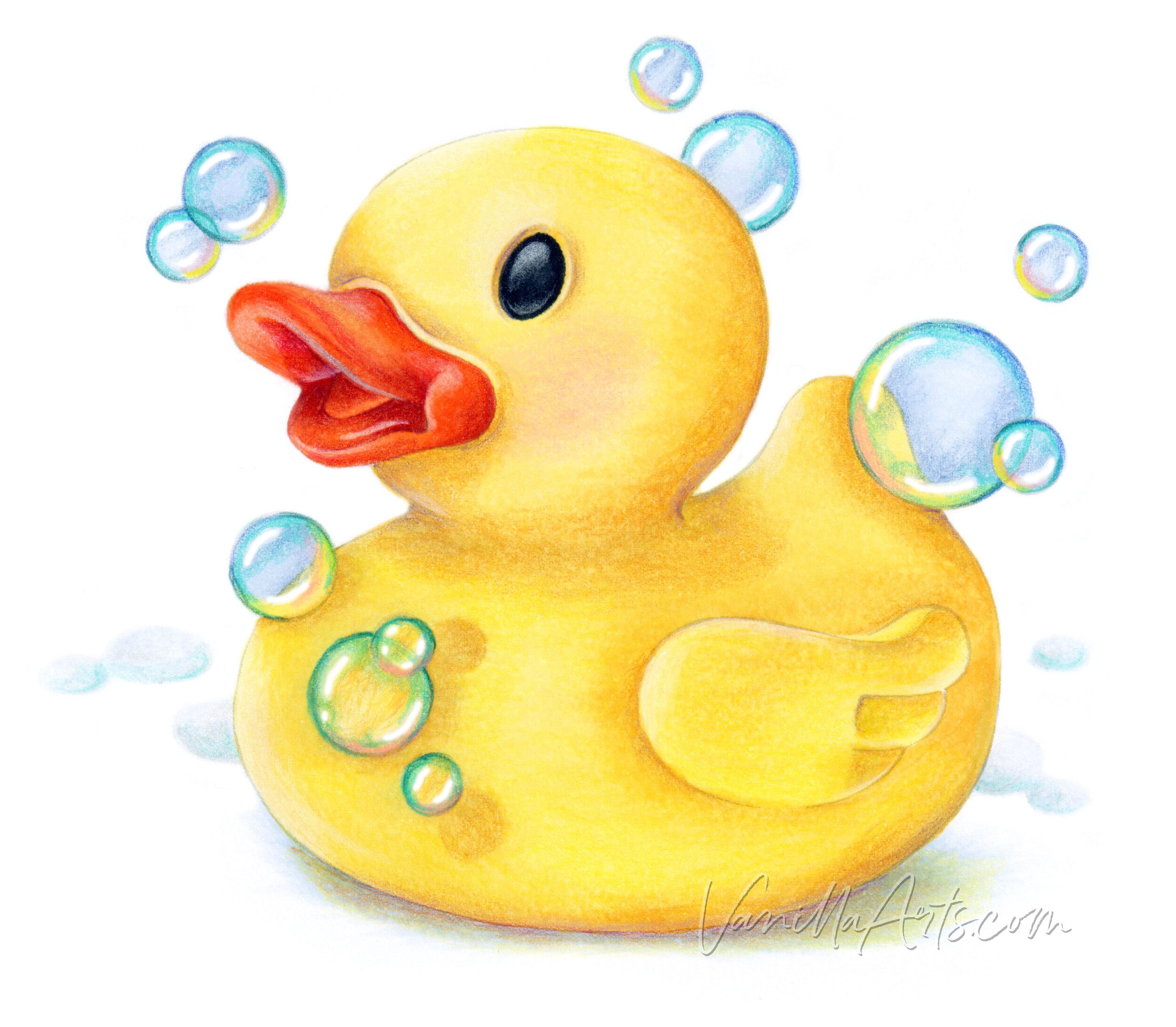
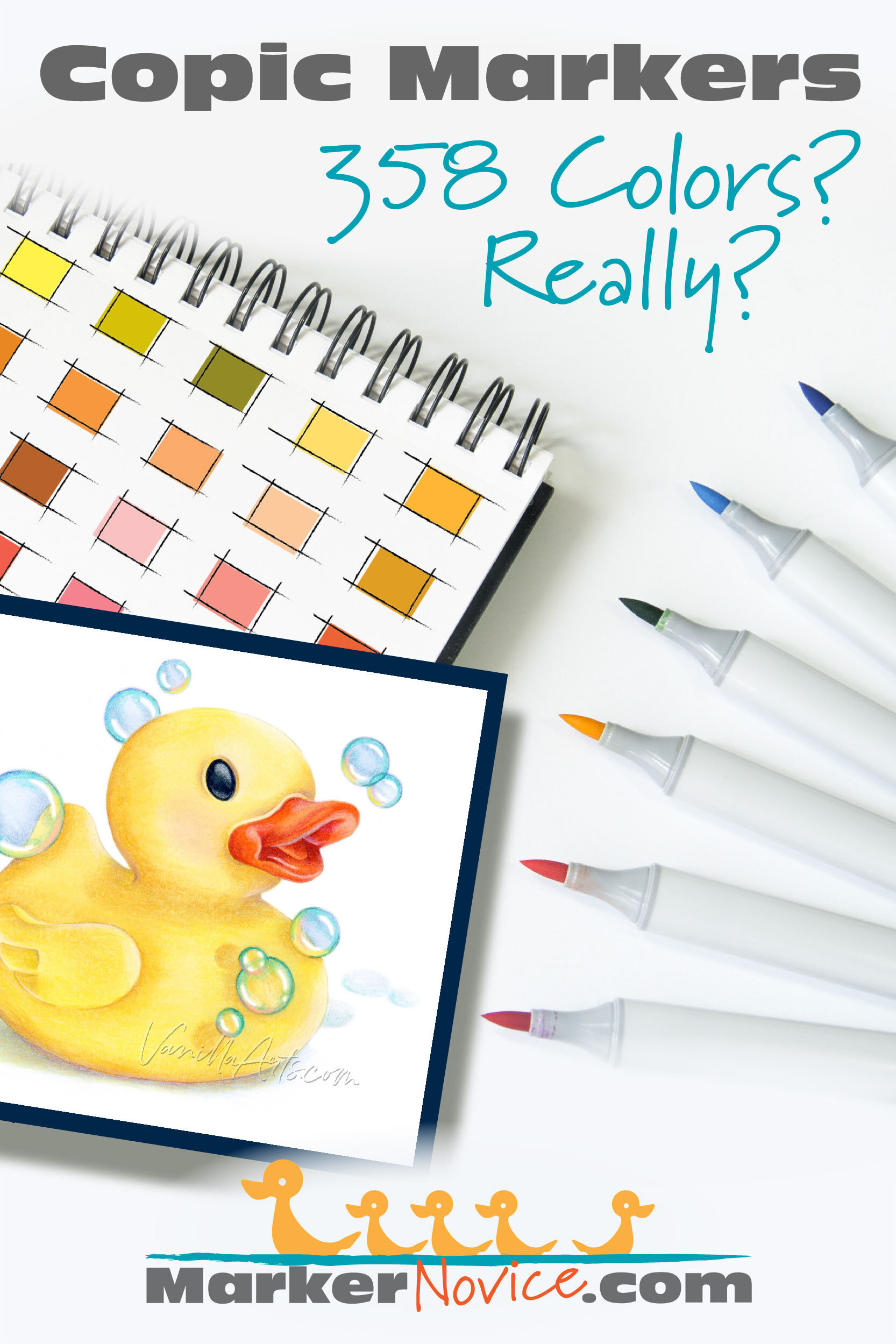
“Rubber Duckie” an original illustration by the author, Amy Shulke. Copic Marker + Prismacolor Premier colored pencils. 8x8” on Cryogen Curious Metallic White Cardstock.
Let’s look at the specifics of each Copic Marker style to help you find the colors you want.

Copic Refills
If Copic makes the color, then it’s available as a refill.
Copic makes refill inks for all 358 colors.
You will never get stuck with a marker that can not be refilled.
See the entire 358 color palette chart for Copic Refills at Copic’s official website here.
While we’re on the subject of refills, I want to warn you about one thing…
Copic used to make a square-ish bottle which they called “Various Ink”. These bottles held 25ml of ink. In late 2019, Copic switched their refills to a 12ml bottle…
Yes, the new bottles are half the size.
(Updated bottles are cylinders with a long needle nose dispenser.)
On some websites and auction sites, you can still find the older 25ml bottles.
BEWARE: Copic Various Ink 25ml bottles contain EXPIRED INK!
Square bottle ink has not been produced since early 2019. Copic ink has a shelf life of 3 years. Therefore all square bottles are long past the expiration date!
Now to be honest, I’m writing this in 2024 and I’m still using the last of my square bottle refills. I can tell you that Copic ink does not go rancid, it does not separate, and even though my Various Inks are 3+ years beyond the expiration date, they work just fine.
But Copic Ink is not lightfast and I keep my inks in a dark storage box inside a dark cupboard. I can guarantee this because they’re my inks.
If you’re purchasing someone else’s old stash of ink, you don’t know if they’ve taken similar care.
I’ve seen bottles of pale yellowish refill ink that were once hot pink, so this is a real concern. Even if the inks are not noticeably pale in the seller’s photographs, they could be only slightly faded— for instance, a B99 ink might look closer to B95. And once the fading process starts, it degrades quickly.
Buyer beware!
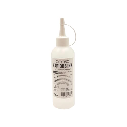
What about Colorless Blender?
Colorless Blender solution is available in 2 different sized refill bottles. The economy sized 200ml/6/7oz bottle has not changed but the 25ml Various Ink refill size is now a smaller 12ml bottle.
I recommend owning both the large bottle and a small bottle. The larger bottle is more cost effective BUT it’s very awkward to pour from.
To limit how often I open the large bottle, I use my small bottle to refill my #0 markers. Then when necessary, I refill the small bottle with the large bottle.
Colorless Blender does not go bad and the bottles are fairly airtight. I know the large bottle seems overkill to a hobby level colorer but I think the cost savings is worth it. I go through one large bottler per year. Even if it takes you 2-3 years to use your bottle, do not worry. Copic Colorless Blender will not expire or lose it’s effectiveness.

Copic Sketch Markers come in 358 colors
It seems like everyone owns at least a couple of Sketch markers. It’s hard to avoid them.
Copic Sketch are the top-selling style. They come in all 358 colors.
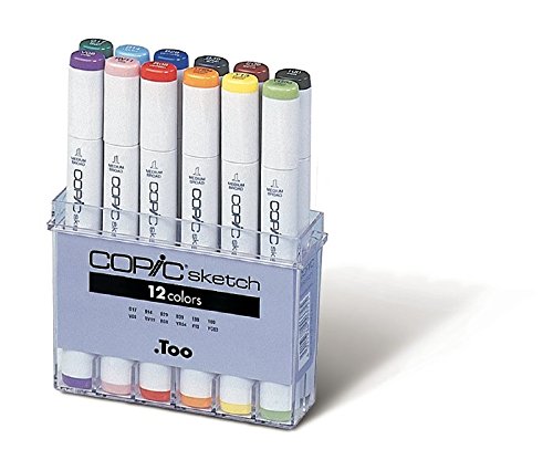
That’s 358 including the colorless blender.
The last new colors were introduced in 2012.
If you’re listening Copic, it’s been over a decade since you’ve introduced new colors. I’d kill for a B61 and more complete range of yellows.
See the full Sketch color palette at Copic’s official website here.
Sketch markers with their distinct oval shaped barrel were developed for professional artists. Many hobbyists also choose Sketches, knowing that they can continue to build an entire collection without mixing marker styles.
Read more about Copic Sketch markers in our article here:
(Link leads to the recommended supply page on our main site, VanillaArts.com. We keep one list for both sites to insure the links and buying tips are current.)

Copic Classic Markers come in 214 colors
Do you have the original square barrel Copics with a fine nib (bullet) and a broad chisel nib? If so, you’re working with a smaller color palette.
Classic Copics come in the original range of 214 colors.
This includes the Colorless Blender.
See the full Classic color palette at Copic’s official website here.

I started with Classics in the 1990s and honestly, I never felt at a loss for colors. Overall, 214 is a very workable collection. There’s a good selection from every color family plus all the grays from all four groups.
But remember, Classic Copics were not designed for blending.
I know this sounds strange to beginners who think Copic was, is, and always will be a blending marker; but Classics were developed long before blending became popular. Back in the dinosaur days, we did not blend. The paper we used at the time would never tolerate modern blending.
Copic Classic Markers are for drawing, not coloring.
This is why you’ll find some Classic markers with no easy blending partners.
Copic Classic have a good selection of colors but if you like blending, avoid Classic markers.
Read more about the Copic Classic Marker in our article here:
Subscribe to our weekly newsletter at VanillaArts.com for access to our FREE DOWNLOAD LIBRARY. The starter list is in the library — follow the newsletter instructions to download your copy.

Copic Ciao Markers
Most Copic beginners have Ciao Markers.

Ciao Copics are value priced, so you get more Ciao markers for your money. But economy has a hidden inconvenience.
Ciao Copics come in a very limited range of 180 colors.
That’s 180 including the Colorless Blender.
See the entire Ciao color palette at Copic’s official website here.
I could never work with Ciao markers alone. There are too many gaps in the color palette.
I actually tried this a few years back— I taught at a store which only carried Ciao. It was incredibly frustrating; The store finally started carrying Sketch markers because it was too hard to run classes with only Ciao colors.
Favorite colors which are not available in Ciao style: R24, R89, YR24, YR27, Y13, YG01, G24, G40, G43, BG11, BG53, BG57, B21, B34, BV01, BV20… and that’s just off the top of my head.
Even worse, there are no neutral gray Ciaos (ack!). Of the grays they do have? I don’t understand why there are no 4s, 6s, or double-zeros which I use regularly. And they don’t go darker than a 7 which is problematic for me since I don’t use black in my artwork.
As an entry-point for beginners, I recommend Ciao Copics.
BUT I always warn students that you will not be able to stay inside the Ciao ecosystem very long.
Ciao limits you to half a collection. The 180 colors are all useful colors. I don’t see any dead weight in the Ciao palette, but I also can’t un-see the big gaping holes.
Read more about Copic Ciao Markers in our article here:

Copic Wide Markers
Copic Wide was once 35 colors plus a Colorless Blender.
Not anymore.
Copic Wide comes in ZERO colors! Today’s Wides are do-it-yourself markers.
If you spot colored wides in a store, it’s been sitting around on the shelf for a long time. It may be expired.
If you want a Copic Wide now, you must buy the empty marker (called a “blank”) and fill it yourself with a Copic Ink Refill bottle.
Do-it-yourself isn’t a bad thing! I never liked the available color selection for Wides, so I’ve been buying blanks for years, creating the colors I need instead of settling for the colors they made.
The downside to DIYing a Wide is that you’ll never have a color coordinated cap. I’ve had to label the side of the marker with a nasty piece of tape which feels terrible as I use the marker.
Grrrr. I really wish they would come up with a better way to indicate DIY colors. They’re not cheap but the tape-on-the-side method sure makes them look cheap!

Black Edition?
Ever seen a black body Copic? They’re rare but they do exist.
Black 25th Anniversary Sets were a limited edition release 2017.
Limited Edition Copics came in 36 total colors released as one box or in smaller sets of 12.
The Black Anniversary series looks like a Sketch marker but the nibs are different. Normal Sketches carry a Super Brush nib on one end and the Broad chisel nib on the other. The Black Anniversary style is a Super Brush plus a Fine Nib bullet.
The Black Anniversary did not contain any new colors.
You can see a photo of the Anniversary 36 on Debbie Olson’s site here.
I sold my Classic style markers to get away from the bullet nib so I never bought the Black Anniversary.
Wait, what’s a C30?
Don’t be silly! There’s no such thing as a Cool Gray 30!
Ahhh, grasshopper. Yes, there is.
30th Anniversary Classic Sets were a PRIVATE gift release in 2017. Most people don’t realize they exist!
Here’s a photo at Copic in the Craftroom on Facebook. Michelle Houghton who runs the Copic in the Craftroom channel at YouTube (and blogs at Scrapweaver.com) was one of the lucky ducks to receive a 30th set when she attended the anniversary event in Japan.
As you can see in the photo, most of these colors are just figments of your imagination. There are no refills for them, so they’re the exception to the every-marker-has-a-refill rule. The 30s are beautiful little one-offs.
And that Y30? Oh Copic, pretty, pretty please!!!
Discontinued Colors?
Nope.
Copic has never discontinued an ink color.
Have they discontinued products? Yes.
But not inks.
You can see the full discontinued product list on their official website here. It’s mostly paper and marker storage but please pause for a solemn moment of silence when you get to my beloved SP Color Multiliners.
Oh dear, (sigh). They were truly beautiful.
Many Stores do not stock all 358 colors

Yes, Copic makes 358 colors but I’ve personally never seen all 358 colors on the shelf in a local store.
First off, to carry the entire Copic line is expensive for stores. Most small shops prefer to special-order a rare color for you instead of buying 6 and letting them rot on the shelf.
But also, there’s always something on backorder from the factory. Always.
Even if your shop is great at stocking shelves with just the right products, sometimes they can’t get the colors they want because the supplier doesn’t have any.
Here’s the other issue you may not realize when you begin buying Copics:
Many chain stores will NEVER carry all 358 Copic colors.
Big-box retailers (Jo-Michael’s Lobby Mart) create their own “exclusive” palette based on tiny shelf displays. Several chains do not carry the extra colors on their website either. If you’re using the 50% off coupon method to collect markers, you’ll run out of markers to buy long before you have a medium sized collection.
How many colors does Copic make?
It depends upon what you’re buying.
Copic Ink comes in 358 different colors BUT not every color is available in every style.
And that’s the catch!
Before you beat your head against the wall looking for a BG11 Ciao or a Classic V01, do some checking. The color may be listed on your handy-dandy color chart but it might not be available in your preferred style or at your favorite retailer.
Happy hunting!
Amy Shulke is a professional illustrator who has used Copic Markers since 1990. She teaches artistic coloring classes online at VanillaArts.com and locally in south-eastern Michigan.
Marker Novice is Amy’s completely free resource devoted to beginner marker education. For intermediate/advanced artistic coloring articles, see her Studio Journal here.


Quack, quack!
This little duck is bubbly fun.
Beginners can color this duckie small scale and simple. Or you can step it up a notch using the photo reference and the methods I offered in this challenge article.
Amy Shulke’s "Rubber Duck"
Sample shown uses Copic Markers and Prismacolor colored pencils.
Package includes PNG digital stamp with easy print PDF option plus recipe, full color sample, photo reference, and grayscale guide.
Click to receive Marker Novice & Vanilla updates in your Pinterest feed

copic shopping list
Vanilla Arts Co. LLC and its Marker Novice site is a participant in the Amazon Services LLC Associates Program, an affiliate advertising program designed to provide a means for sites to earn advertising fees by advertising and linking to Amazon.com. Vanilla Arts Co LLC also participates in affiliate programs with Dick Blick, Ranger Inc, ShareASale, and other sites. Vanilla Arts Co. LLC and Marker Novice is compensated for referring traffic and business to these companies.