
Best Red Blending Combinations for Copic Marker Beginners: Tips from 4 Instructors
Which Red Copics are Best for Beginners?
We highly recommend Copic’s R-Twenty red series for beginners and anyone building a small, versatile alcohol marker collection. R29, R27, R24, R22, and R20 are traditional reds which can be used for food, flowers, and holiday images. The lighter reds in this series can be used for pink objects.


So, you’re new to Copic Markers and starting to build your collection?
A colorful spending spree sounds like fun until you’re confronted with 10 similar shades of red. This wasn’t supposed to be so stressful!
I remember those days. Money was tight, so I had to pick colors wisely. Even with an art degree, I still made rookie mistakes. My first major purchase was a 72-set and many of the markers from that original box are still gathering dust today!
If I had to do it again, I’d focus on useful individual blending combinations, buying just the colors I needed at the time. It’s only a bargain if you actually use the marker!
In the spirit of helping you avoid my mistakes, I started to wonder:
What’s the best red blending combination for Copic Marker beginners?
I asked three of my favorite marker instructors about which reds they recommend for first time colorers.
Which reds offer you the best value?
Which Copic reds are versatile enough to color many red items?
Which reds do we teach with?
Which red markers do we use in our own work?
Which Red Copics are Best for Beginners?
We highly recommend Copic’s R-Twenty red series for beginners and anyone building a small, versatile alcohol marker collection. R29, R27, R24, R22, and R20 are traditional reds which can be used for food, flowers, and holiday images. The lighter reds in this series can be used for pink objects.
Let’s talk to four Copic instructors to find out why.

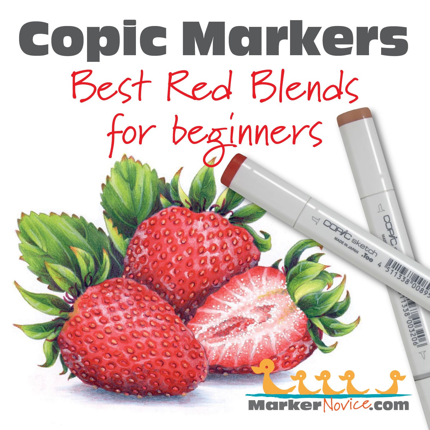
“Strawberry Trio” by the author, Amy Shulke. Copic Markers and Prismacolor Colored Pencils on X-Press It Blending Card paper. This project is the finale of Marker Painting Foundations, a 12 week course to improve your Copic Marker coloring. More info here.
Michelle Houghton’s Favorite Reds
Find Michelle on her Copic in the Craftroom channel at YouTube and at Scrapweaver.com
Michelle recommends R29-R24-R22 for Copic beginners. She frequently adds R59 if she needs a darker combination.

Michelle says:
The reds I most-often reach for are R22, R24, R29, R59. I also teach with them. This a very standard blending group but it’s one I have reliably used for a very long time.
However, I have shifted. Originally, I colored them from light to dark, now I tend to use them dark to light.
The R-Twenties are incredibly popular with colorers at all levels for a reason. R29 is a traditional fire-engine red, it’s not noticeably warm or cool, it’s just a beautifully balanced red.
Watch Michelle demonstrate her combination, offering tips for blending this combo both light to dark and dark to light.
In this next video, Michelle offers a more advanced combination, it’s beautiful!
__________
Michelle is an elementary school teacher (BS Fine Arts, MA Education) with over 20 years of paper-crafting experience. She’s is a former Copic Certification Regional Instructor for Imagination International. Michelle runs the Copic in the Craftroom website and YouTube channel. Her Copic College events are favorites with Copic fans at all levels.. Visit her at Scrapweaver.com.
WE ASKED YOU!
In our survey of frequent Copic colorers, R29-R27-R24 was by far their favorite red blending combination.
R59-R46-R24 was the next most popular with some very strong supporters.
I asked about other red combinations such as the R-Teens and R-Thirties but most felt these were for “special conditions” rather than all-purpose coloring.
Cordine van der Touw’s Favorite Reds
Find Cordine’s latest projects on her Facebook page here, also at Copic Marker Europe and her latest classes for Copics at Colourstock.
Cordine recommends R59-R46-R24 as a beautiful red for beginners. She adds R14 if she needs a lighter red in the combo.
Cordine says:

R46 is my base red. It’s gorgeous. R59 adds a lot of depth and I can add B34 underneath if I need even more darkness.
R24 is a very versatile red which works with my combination here plus many other red combinations. I recommend it for beginners.
What Cordine does here is very smart. She started with a base red which she loves (R46) and built her combination around it.
A good collection of markers must include your personal preferences because the markers you like are the markers you’ll use most. Start with a color you love to create a combination that’s perfect for you.
And a side note— Notice that Cordine’s combination jumps across several number groups. She’s combining a 59 with 46 and 24. Cordine proves that beautiful things can happen when you mix the numbers.
I also agree with Cordine, if you’re making your own combination, R24 is an extremely flexible color which works well with many reds.
__________
Cordine is an office manager in The Netherlands. She’s an avid paper crafter who loves card making, scrapbooking, and coloring stamps with Copic and colored pencils. She has taught Copic since 2013 for Colourstock as the Benelux region representative (Netherlands, Belgium, and Luxembourg). Contact Cordine here.

Elena Cazares’ Favorite Reds
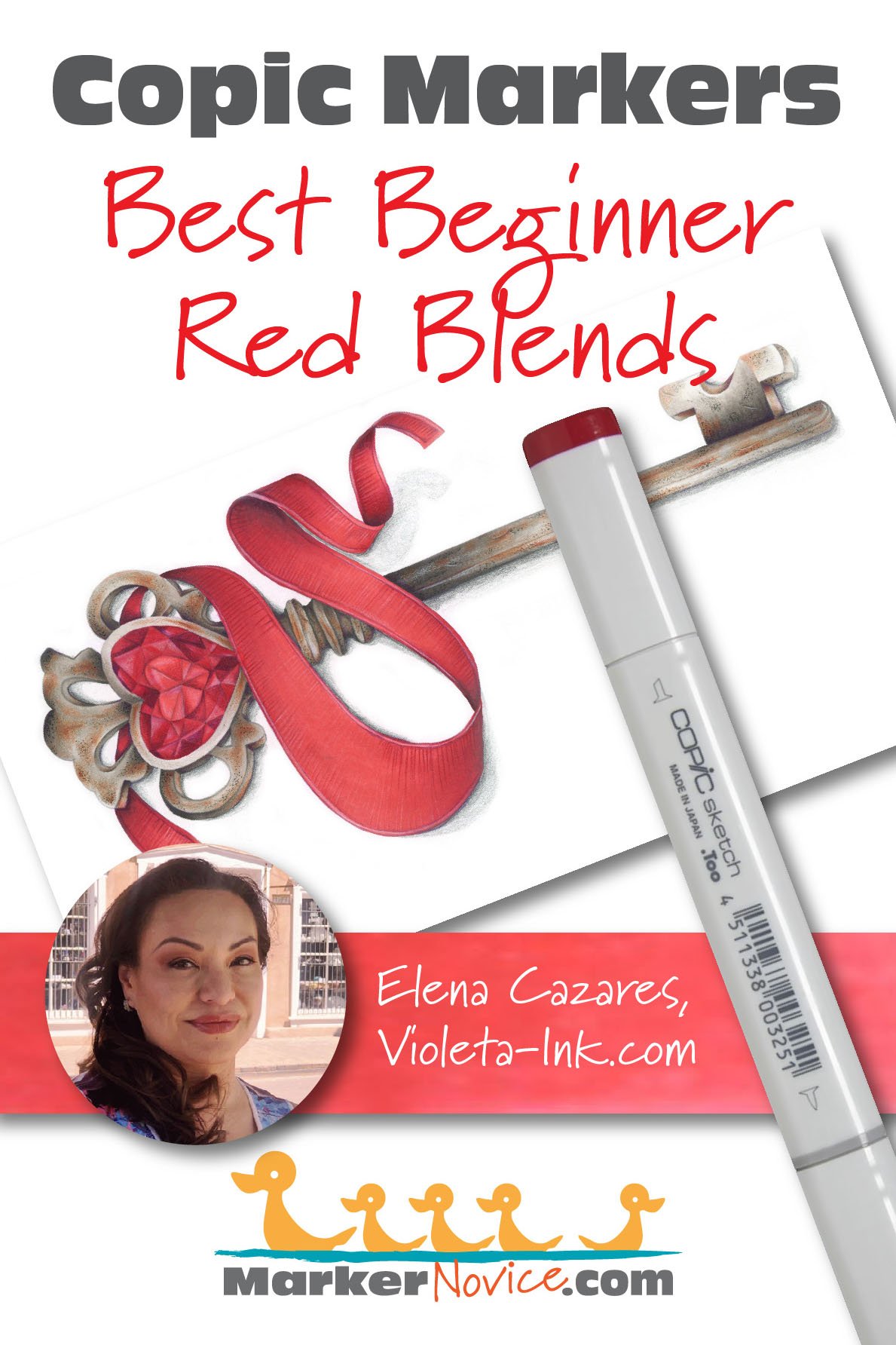
Elena recommends R29-R27-R24 for beginners. For an added challenge, try underpainting the R29 with B32.
Elena says:
I love working with this combination because it’s a bright, true red. The R27 makes this an easy-blending combo for beginners. Be sure to completely cover the R29 with lots of R27 ink to make the smoothest blend possible.
In my own coloring, I always underpaint this combination with B32 but if I want a deeper red, I used B34. Beginners can skip the underpaint or try it when they feel brave.
Elena is correct. You’ll often see advanced Copic colorers use the R29-R24-R22 combination, as Michelle Houghton recommends.
I frequently do this myself, skipping more than the recommended 2 number values. Look at the last number on the cap, from R29 to R24 is a larger than average distance.
But R29 is a staining color. The jump from 29 to 24 is a big step for beginners, ESPECIALLY when you work at a larger scale as Elena does. It takes practice to blend big jumps seamlessly on 8 inch images. Elena recommends that beginners use R27 to fill the gap. This creates a gentle transition from R29 to R27 to R24.
Elena’s combination turns out slightly darker than Michelle’s but they’re both beautiful and extremely useful blends which you’ll use for a lifetime.
Amy Shulke’s Favorite Reds
Hey, that’s me! You can find me here at MarkerNovice.com or at my artistic coloring site, VanillaArts.com.

My favorite red combination is R29-R27-R14. This results in a warmer red with no traces of pink.
I’m torn about red Copics. R29 is my definition of a true red but the R-Twenty Copic group is weird. From R22 down, the colors get oddly cool and very bubble gum pink.
Pink is NOT light red!
Pink belongs in the magenta family.
I usually teach with R29-R27-R24 or R29-R24-R21.
But in my own work, to keep my reds warmer and truly red, I switch to R14. I sometimes continue downward to R12 and R11. R14 has a much warmer feel than R24.
As with all the instructors above, I underpaint my reds. I do not use R39, R59, or R89 as a standalone “dark” red. They’re not desaturated enough to look like realistically shaded red.
For beginners, I recommend underpainting R29 with B32. I teach beginners with B32 under R29 in most of my classes.
In my own work, I usually underpaint R29 with BV23. My strawberries in this article show BV23 at work to make the underside of the berries look shady and distant. Remember, the underpaint color only goes in the deepest, shadiest places. Leave room for R29 to shine by itself as a pure red because it’s gorgeous on its own.
And in case you’re wondering, I did not invent underpainting. Underpainting goes back several centuries to classical era oil painting. I’m simply one of first fine artists to promote underpainting as a technique specifically for Copic Markers. To be honest, when I started underpainting Copics, I didn’t realize that nobody else was doing it!

Do Beginners need to Underpaint Red?
No.
If you’re brand new to art and you’ve never drawn, painted, or used Copics before, you don’t need to worry about underpainting. Skip it.

Underpaint creates the look of realistic shade by creating a dirty, dingy red. In art, we call this “desaturation”.
Real shade is not darker, it’s desaturated.
But for beginners, it’s much more important to learn how to color reds with confidence.
This means mastering easy blends from one R marker to another.
Learn to blend your reds smoothly and stay inside the lines without over-inking the image before worrying about underpainting for realism.
Once you’re blending without thinking too hard about the process, then add underpaint as a challenge element.
B32 and B34 are excellent all-purpose underpaint colors which work under reds, greens, purples, magentas, and browns. Or try N2 and N4 which work under all the previous colors plus orange and blue too.
You’ve got years to work on building skills. Master blending red to red before you branch into underpaint.
And hey, when you’re ready, choose an instructor who actually understands underpainting. It’s a step up from hobby-level coloring so you’ll want to learn from someone skilled enough to explain the color selection process. Don’t get stuck with a trend-following instructor who simply feeds you underpaint recipes they found on the internet.

It’s Hard to Imagine a Copic Collection Without R29!
There are some colors you can delay buying for a while (even years) but a traditional red combination should be one of your first investments.
As you can tell from the four instructors in this article, we all prefer slightly different combinations but we’re consistent about liking the R-Twenty markers.
R-Twenties are great for value and versatility.
Copic’s R-Twenty series of reds is ideal for beginners. R29, R27, R24, R22, and R20 can be used together or as key parts of unique blending combinations.
I know it’s tempting to start with the lowest number family and many of the Copic sets will give you R-Zeros or R-Tens before the R-Twenties… but there’s a reason R29 is Copic’s top selling red.
R29 is popular because it’s beautiful but it’s also pretty darned handy!
Keep the R-Twenties in mind as you shop for your first red blending combination. They’re an excellent first-purchase.
And if you can’t find R29, I agree with Cordine— R46 is close in both color and value. It’s even a bit less staining than R29. Give it a try!
Amy Shulke is a professional illustrator who has used Copic Markers since 1990. She teaches artistic coloring classes online at VanillaArts.com and locally in mid-Michigan.
Marker Novice is Amy’s completely free resource devoted to beginner marker education. For intermediate/advanced artistic coloring articles, see her Studio Journal here.

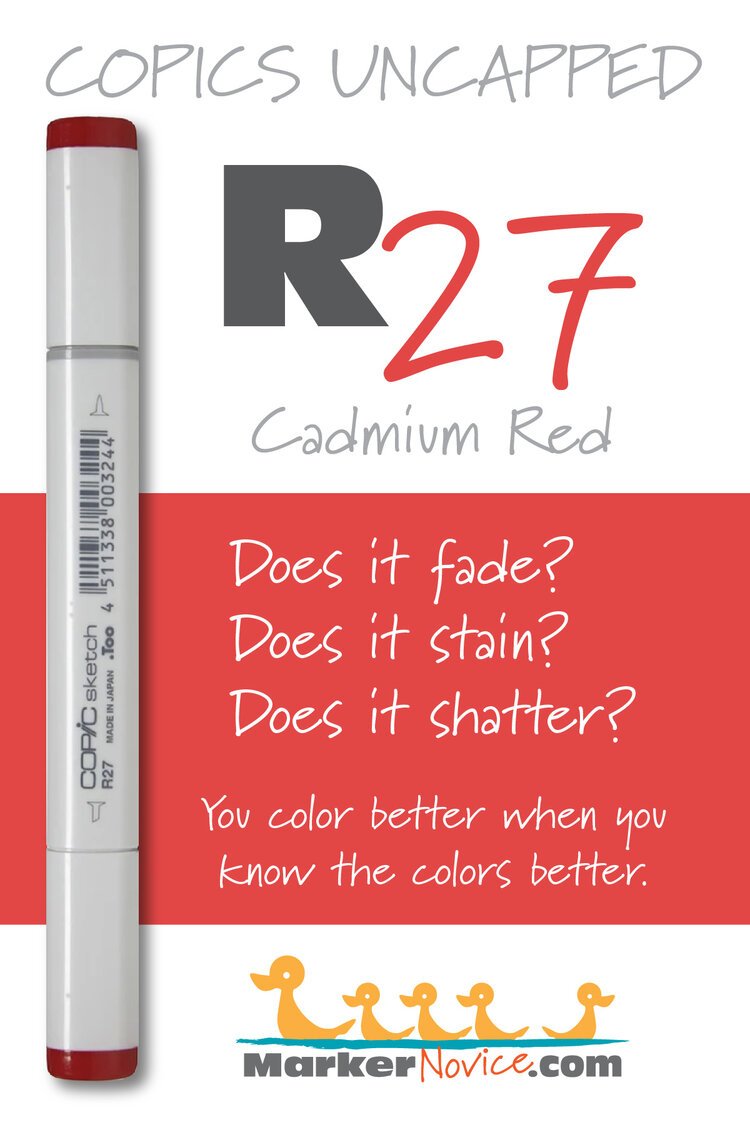
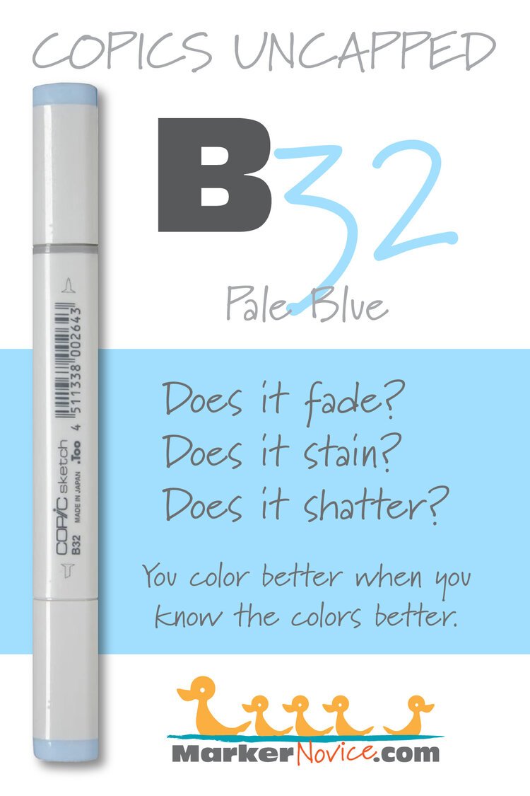
Marker Testing: Colors mentioned above











How to Store Copic Markers: Horizontal or Vertical?
Horizontal or Vertical Marker storage: Does it matter?
There are so many storage options for Copic Markers. When you’re ready to graduate from the free shoe box you’ve been using, you’ve got tons of options— everything from zipper craft bags to hard plastic locking boxes.
Some storage units stand the markers upright. Some store them laying down. But which option is healthiest for the markers?

When you’re a Copic Marker beginner, there are so many little questions. Some of the things you worry about seem silly but then again, maybe it’s a big deal? You’d hate to accidentally ruin your markers.
I teach artistic Copic Marker and one of the most common questions students ask is:
“What’s the best way to store my Copic Markers? Horizontal or vertical?”
A quick search of the internet does not provide a definitive answer. Some people store Copics horizontally and some vertically. Is one way better than the other?
I’ve used Copics professionally since 1992. Today, let’s look at what I’ve learned in almost 30 years of marker use.
Is it better to store Copic Markers horizontally or vertically? The truth is, it really doesn’t matter. Copics are not gravity fed— they work through capillary action which prevents the ink from sinking to the lowest point of the marker. Whichever way you store your Copics, they’ll be fine.
Note: this article contains affiliate links to products mentioned. We only link to products we endorse and we source them to retailers we use and trust.
Horizontal or Vertical Marker storage: Does it matter?
There are so many storage options for Copic Markers. When you’re ready to graduate from the free shoe box you’ve been using, you’ve got tons of options— everything from zipper craft bags to hard plastic locking boxes.
Some storage units stand the markers upright.
Some organizers store the markers laying down.
But which option is healthiest for the markers?

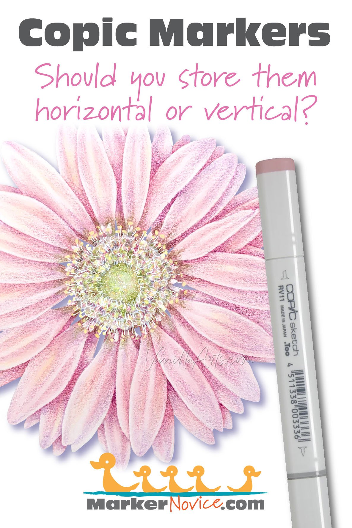
“Sunny Gerbera” colored by the author, Amy Shulke. Copic Markers plus Holbein Colored Pencil details. This digital stamp is available for purchase at Sketch-Garden.com here.
It seems like if you left your markers upright for a long period of time, maybe the top end might dry out a bit as the ink falls down to the lower end.
But then again, if you store Copics for a long time horizontally, maybe the ink might seep down to the lowest point in the center, pulling ink away from both ends?
And you’ve spent far too much money on these markers to accidentally ruin them by storing them the wrong way!
Relax. Copics are not affected much by gravity! Store them whichever way is most convenient to you.
Stop worrying. You won’t ruin your Copics by storing them in the wrong position.
And stop listening to folks preaching about the hellfire and brimstone headed your way if you don’t heed their storage advice.
It doesn’t matter which way you store your Copic Markers.
Both horizontal and vertical storage units work fine.
There is no wrong way to store your Copic Markers.
Copic Markers defy gravity
Let me preface this by warning you that I wasn’t a physics major.
I was an art student. We didn’t do much of the mathish-sciencey stuff.
But here’s what you need to know about Copic Markers:
If Copic Markers were nothing but liquid ink inside, you’d need to worry about which direction you stored the markers. In this case gravity would feed each nib and whichever nib pointed upward would slowly drain to the lower end.
But Copic Markers are not empty inside!
Inside your marker, there’s a fibrous sponge. We call this the marker core. The core is suspended in the center of the marker and each nib inserts into the core.
The core holds the ink and feeds it to both nibs equally.
Now here’s the thing about the core. Remember when I said it was fibrous? That’s the key to marker physics.
pssttt… “fibrous” is just a fancy way of saying “made from a ton of little fibers”
Fibrous cores act like a sponge… actually, they’re better than a sponge. They hold all the wet ink particles using what’s called capillary action. You can read more about capillary action on Wikipedia here.
But if you want the art student’s explanation: Remember the last time you spilled your coffee and you used a towel to soak up the mess? The towel absorbed the coffee and held the liquid between the threads until you could wring the towel at the sink. That’s capillary action at work— the towel absorbs the liquid and stores it for you.
Your marker core holds ink the same way.
Capillary action is pretty cool because if given enough time and little opportunity to evaporate, the core distributes the ink between all the fibers equally. Then the nibs also grab onto the moist ink (more capillary action at work) and the nibs then hold the fresh wet ink.
And here’s the magical part: Capillary action is stronger than gravity!
Thanks to capillary action, the ink isn’t going anywhere.
The ink inside your marker absolutely will NOT settle because capillary action is stronger than the pull of gravity.
So all of this worry about the top nib drying out or the bottom nib getting too juicy is pure fiction.
But the Copic Website says…
Oh my gosh.
If you’re free for the next couple of years, can I vent about how bad the Copic website is?

I’ve used Copics for almost 30 years now and that was back before they had a website.
Yes, I’m a dinosaur. I go back to the days when there was a paper catalog with user info and tips in the center section.
In the last 30 years, Copic has never been able to make up their mind about which direction to store the markers.
I’ve seen Too (the parent company of Copic) recommend horizontal and in other places recommend vertical. I’ve also seen them say it doesn’t matter.
In Copic Certification Classes (sponsored by Imagination International, not Too), the instructors all agreed it didn’t matter.
I visited the website once in 2019 to show a student where they said it didn’t matter only to find they were recommending vertical. And if you check it now, they’re saying horizontal again.
Their current website is a complete mess— a poorly translated version of the Japanese site and I’m guessing the translator has never touched a marker.
So you can’t go by the website. They’ll change their mind again tomorrow.
Forget what Copic says— what do they actually do?
This part is the clincher for me.
Copic may change their mind whenever the wind changes direction but let’s think about this for a minute…
All Copic Markers are manufactured in Japan and exported to other countries.
So Copic Markers sit in a box waiting to go from the factory to the shipping center. Then they’re loaded into shipping crates and loaded onto a giant boat. Then they float across the ocean until they land at a sea port where they’re loaded onto a semi truck or an airplane. The truck or airplane then drives to a distribution center where they sit in storage until a retail store orders them as inventory. Then they’re shipped to the store where they’re displayed on shelves for months or even years until you walk in and purchase it.
At no point in this process is the box ever marked: THIS END UP!
From the factory floor to your door takes many months. If Copic cared about horizontal or vertical, they could easily indicate which direction to transport and store the markers.
And here’s another interesting point:
Too does not indicate on their packaging which way to display their markers.
Too provides horizontal storage units to stores for single open stock markers.
Too makes hanging vertical packages for trios and assortments.
Too sells marker sets in vertical storage acrylic boxes.
Too sells both vertical and horizontal desk units, bags, wallets, and storage cases.
So it makes no sense that the only time Copic cares which direction you store the markers is after you’ve paid money and taken the product home.
If it mattered, if Copics were really dying on cargo ships or store shelves, they wouldn’t want to risk you buying dead markers.
So if Copic doesn’t care which direction they store markers, why should you?

Find a storage unit that works for you
Store your Copic Markers however you want.
You can store them in stand up units on your desk or put them in travel sleeves. In a box with a fox or on a train in the rain…
Horizontal or vertical doesn’t matter.
Organize your Copic Markers in whatever way works best for your needs and in your space.
There is no best way to store a Copic Marker.
There is no wrong way to store a Copic Marker.
Well, maybe avoid storing them in the freezer or the oven… but other than that, you’ve got a free pass to do whatever you want.
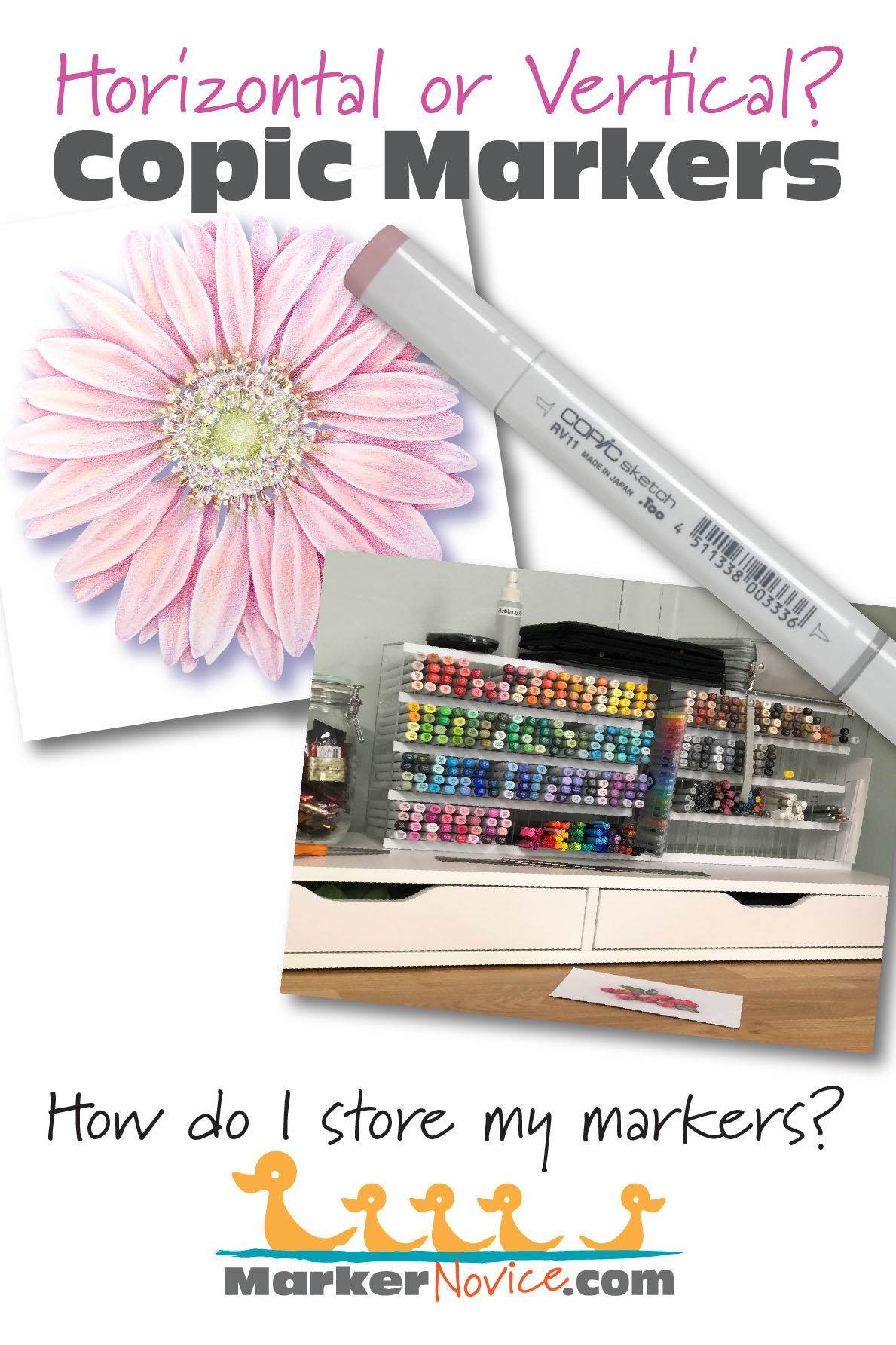
How do I store my markers?
Over the years, I’ve stored my markers many ways.
And in case you’re wondering, I have the full collection minus the Toners and Fluorescents which I never use. At least half of my markers are over 20 years old.
Copics will last a long time if you take care of them properly.
But direction is not part of any proper care routine.
When I first started, Copics came in cardboard boxes (horizontal). I used the boxes until they fell apart, then I moved to a large shoe box (vertical).
Finally, I got rid of my DeSign brand markers and moved my Copics to the plastic display I bought for them (vertical). When that broke down, I used a series of drawers (vertical).
My travel units have been both horizontal and vertical. I now travel with the Copic hard suitcase thing which I’d link you to but apparently it has been discontinued (but it was vertical storage).
My current desktop storage unit is a set of acrylic store displays, also discontinued (horizontal). I’ve just recently moved to a new studio and I’m brainstorming how to create built-in storage which won’t collect dust the way acrylic does.
And how about when I color?
I remove the markers I need from horizontal storage and place them vertically in a mug which prevents them from rolling onto the floor. As I color, I lay what I’m not using horizontally.
Honestly, this is just a long way of saying: It doesn’t matter.
In 30 years, my markers have been stored every which way and they’ve all lived to tell the tale.
In summary:
It doesn’t matter whether you store your Copic Markers horizontally or vertically. Both work.
Copic Markers are not gravity fed, they work by capillary action which means the ink will not sink inside the marker.
No matter which way you store your marker, providing that your marker is kept full and juicy, you’ll always have a marker ready for coloring.
“Sunny Gerbera” colored by the author, Amy Shulke. Copic Markers plus Holbein Colored Pencil details. This digital stamp is available for purchase at Sketch-Garden.com here.
Amy Shulke is a professional illustrator who has used Copic Markers since 1990. She teaches artistic coloring classes online at VanillaArts.com and locally in Michigan.
Marker Novice is Amy’s completely free resource devoted to beginner marker education. For intermediate/advanced artistic coloring articles, see her Studio Journal here.
Further reading on related topics:



Beautiful Botanicals
We’ve got a garden full of sketches for you to color
Sketch Garden: Realistic line art for budding artists
Digital stamps are fun but they lock your project into the style of the original stamp artist. Sure, you colored it but the project never fully reflects your taste and personality.
Artist-grade line art for your unique artistic interpretation
Sketch Garden line art doesn’t come to life until you add a healthy dose of YOU. We give you accurate details and wide open spaces but we’re leaving the artistry up to you.
Perfect for any style of coloring from photo-realistic to wild & loose expressionism. Ideal for Copic marker, colored pencil, pastel, watercolor, and especially mixed media.
Stop coloring other people’s art and share what’s in your heart.




Copic Markers: Should beginners start with Ciao or Sketch markers?
I teach Copic Marker classes and work with a lot of beginners. A common question I hear from brand new students is:
“I’m new to Copic Markers. Is it okay to start with Ciao style markers or should I purchase the Copic Sketch?”
Many people say Ciao and Sketch markers are interchangeable. But as an art instructor, I disagree.
Let’s look at why.

If you’re just starting out with Copic Markers, the choices can be overwhelming! At first, you focus on which colors to purchase first, until you realize…
“Uh oh… there’s more than one kind of Copic to choose from!”
I teach artistic Copic Marker classes and work with a lot of beginners. A common question I hear from new students is:
“I’m new to Copic Markers. Is it okay to start with Ciao style markers or should I purchase the Copic Sketch?”
Many people say Ciao and Sketch markers are interchangeable. But as an art instructor, I disagree.
Let’s look at why.
Copic Ciao Markers are often described as an inexpensive version of the Copic Sketch but the two markers are very different. If your budget allows, purchase Sketch style only. Sketch are more economical to maintain, ergonomically designed, and it’s easier to learn good technique with Sketch Copics.
Let’s look at why Sketch Markers are a better investment for beginners.
Note: this article contains affiliate links to products mentioned. We only link to products we endorse and we source them to retailers we use and trust.
Copic Ciao vs. Copic Sketch: What’s the difference?
Copic Ciao Markers and Copic Sketch Markers look totally different. One is thin and one is fat. One is round with large colorful caps and the other is flat and mostly gray.

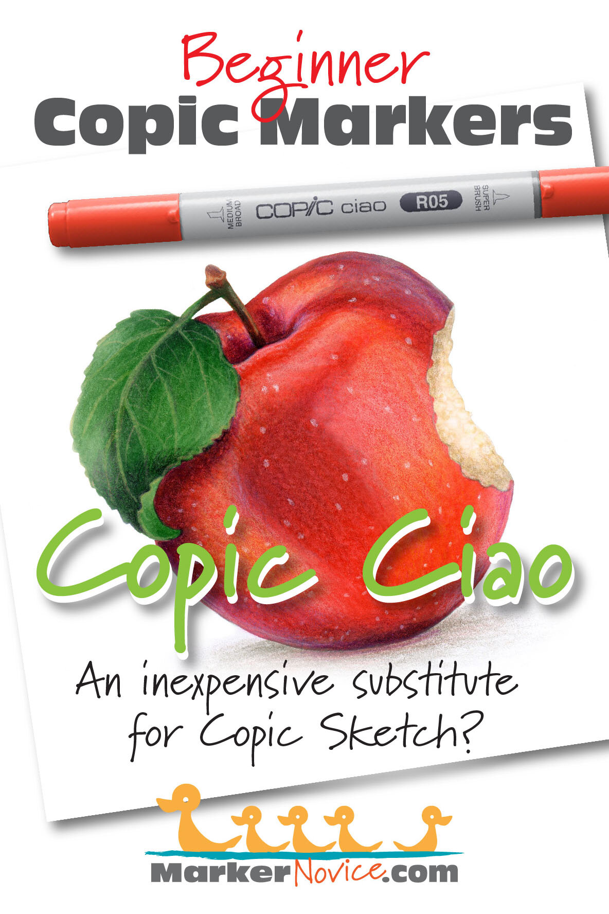
“Basic Apple” colored by the author, Amy Shulke. Copic Markers plus Prismacolor Premier Pencil details.
But when you take the caps off, you’ll see Sketch and Ciao have the same marker nibs: the medium broad chisel and the Copic Super Brush nib.
They have the same nibs, so it’s no surprise when you ask a room full of Copic fans:
“Which style of Copic is best for beginners”
… most of them say it doesn’t matter because the only difference is the price.
I totally disagree.
The ”all the same” myth seems to be reinforced by Copic coloring videos on YouTube where it’s common to see mixed collections of Ciao and Sketch being used together.
But just because people do it, doesn’t make it smart.
I’ve drawn and colored both professionally and for fun with illustration markers since 1989. I bought my first Copic in 1992. I know Copic Markers very well and that’s why I teach with them.
As an experienced art instructor, I highly recommend Sketch style Copic Markers for beginners
Actually, I recommend Sketch markers for everyone— beginners, intermediates, advanced colorers, and professional artists too.
This runs completely counter to what the online world says, so let me explain why.
Ciao Markers are not as budget-friendly as you assume
The first thing shoppers notice when comparing Copic Ciao markers to Copic Sketch markers is the price tag.
Ciao markers are about $2 cheaper than a Sketch.
I understand why many beginners choose Ciao markers over Sketches. Colorers want to create blending effects and to do so, you need several related colors. If money is tight or you’re frugal, Ciao seem to be a better deal— it’s hard to say no to a 25% savings!
Ahhhh grasshopper, but that’s just the initial cost.
Over the long term, you’ll spend more money maintaining Ciao markers. There are Ciao performance issues as well. You’ll also end up buying more than a few Sketch markers anyway, so you’re only saving on some colors, not all colors.
Let me emphasize this one more time because it’s really hard to convince people who are already reeling from Copic Marker sticker shock:
Copic Ciao Markers cost more in the long run.
Ciao Markers will save you a few dollars in the beginning but you’ll pay far more than $2 in extra maintenance costs and upgrades over the next decade.
Truly budget-conscious people will skip the Ciao and purchase Copic Sketch Markers.
What are the hidden costs of Copic Ciao Markers? Let’s look closer.
Copic Ciao Caps have serious design flaws
Copic Ciao Markers look like fun.
They’re pretty darned cute, with big bright colorful caps. You can even buy special editions printed with Mickey Mouse or characters from The Little Mermaid. They also sell a sparkle version of Ciao.
Copic Ciao were designed for children and can be purchased in bulk for schools and art programs. They’re even child-safe. The caps are designed with soft plastic and air holes so as not to block a child’s airway if swallowed.

But child friendliness and budget pricing make for a less durable cap.
The plastic cap stretches over time making for a marker which no longer seals properly. Copic talks about this problem here (though they offer no solution other than to buy a new marker, grrr).
Frequent forceful capping and uncapping can lead to stress cracks called “crazing” along the sides.
There’s also some of Murphy’s Law at play: If you drop your cap it will roll away. If someone steps on it, the cap will crack. Don’t laugh, this has happened 3 times in my classes.
Speaking of rolling caps, the only people who have mysteriously lost a cap in one of my classes have been Ciao users. The roll is a problem. Copic knows this so they added a small nub to the side of the cap. It doesn’t really help.
And honestly, for all the cap problems, I’ve never seen replacement Copic caps for sale. If you lose your cap or if it stops clicking tightly, you’re forced to purchase a new marker.
There’s another hidden problem with Ciao caps, one you’ll only notice after it’s too late:
If you look deep inside a Ciao cap, you’ll see a secondary cap inside the main cap. The nib fits into this smaller cap when you recap the marker.
But woe to those who fail to line the marker up correctly.
That interior cap has a sharp edge. I’ve personally hacked pieces off the edge of a chisel nib when I didn’t have the cap exactly centered. If you’re off center, just a wee bit to the left or right, the inner cap slices into your nib. I’ve cut a vicious notch into the center of a chisel nib; the marker now draws 2 stripes instead of one. I’ve also bent the heck out of a Super Brush nib; the nib was beyond repair.
Compare that to the inside a Sketch cap where you’ll see a gentle, rounded, can’t-screw-it-up sanctuary for nibs. The Sketch’s cap is designed to safely guide your nib into the center of the cap; you’d have to work pretty darned hard to damage your nib with a Sketch cap.
I’ve also seen far fewer seal failures, cracks, and accidentally dried-out nibs with Sketch markers— both with students and in my own marker collection where I have several markers over 20 years old.
Ciao caps are vicious to your nibs and they wear out faster than Sketch caps.
If economy and longevity are your goal, stick with Copic Sketch Markers.
Copic Ciao have a limited color range which forces you into a mixed collection
Copic Ciao come in 180 colors but Copic makes 358 colors. That’s 178 colors you’ll have to purchase in Sketch style.
You can’t build a full Copic collection with only Ciao markers.
I do not think it is possible to do artistic coloring with only Ciao style markers. There are too many important gaps in the Ciao color palette.
If you’re doing casual card making or coloring books, you might get by with just a Ciao collection. I’m skeptical but okay, maybe. But as soon as you take a class or try to color with realism, you’ll need colors not available in the Ciao style.
I tried to create a series of beginner classes which used nothing but Ciao. I couldn’t do it. Ciao is missing many important colors. You can see the full Ciao palette at the official Copic website here. It looks pretty good at first glance, but experienced Copic users soon start to notice missing colors and holes:

Ciao has no grays darker than a level 7 (I typically teach with 8 and 9)
No neutral N grays (which I recommend as a beginner’s first gray purchase)
Most of the pale Ciao markers come in the form of 00 or 000 (as opposed to colors with only one 0, like E30 or G40). Sub-zero markers often blow-out a blending combination because there’s a lot of solvent in the ink formula.
The Ciao palette focuses heavily on colors which start with 0. The “zero” families are unnaturally bright. Many look like highlighters with noticeable florescence.
Ciao markers all lean towards the lighter end of a color family with very few markers which end in 7, 8, or 9. This makes it hard to shade with realism.
Several Ciao have no natural blending partners
Ciao is missing my most used cast-shadow marker (BV20)
The purples selection is just weird, they either lean pink or look dusty.
Ciao is heavy on pinks yet missing any organic looking blending combinations
No Ciao R24 which is essential to the natural blending combination for Copic’s top selling red, R29
Ciao has only one organic yellow (Y21) but gives you nothing to blend it with
WE ASKED! 100% of Vanilla Arts students who prefer Ciao markers also own several Sketch markers.
But also, Ciao is simply missing many of the colors I see instructors calling for on a regular basis.
So as I said above, purchasing Ciao dooms you to a mixed collection of some Ciao and some Sketch markers. I’m not saying an assorted collection is fatal, you see people using mixed collections with great skill on YouTube all the time.
As an instructor, here are the issues I see with mixed collections:
There are no organized storage containers for a mixed collection. If you want to keep your markers in numeric order, you’ll always be tucking Ciaos lopsidedly into holes meant for Sketches.
The best storage systems for a mixed collection work on the bucket system where you chuck 10 to 20 similar markers into large divided areas. This lack of numeric order storage is bad for beginners. It encourages duplicate purchases and doesn’t alert you to lost markers or improperly capped markers.
My mixed collection students take longer to find their markers because they have to remember “is that color a Ciao or a Sketch?”
The ID number on a Ciao is on the side of the marker and poorly marked. It’s a kinda-dark mid-tone gray number printed on a kinda-light mid-tone gray body. It’s hard enough to grab the right marker when you’re working fast. Ciao encourage mistakes.
Ciao markers run out of ink faster than Sketches. When I see students with dead markers, it’s usually a mixed collection and it’s the Ciao which ran out of ink because they expected it to last as long as the Sketch.
Students with mixed collections often have issues learning good marker technique. More on that below.
Students with Ciao markers tend to replace the Super Brush Nib more frequently. More on that below, too.
Now let’s talk money.
People who start with Ciao markers frequently spend more money on their ideal marker collection than those who start with Sketch.
And I don’t mean the cost of maintaining the markers.
I mean spending more on actual markers.
Starting with Ciao makes superficial sense if you’re not sure about markers. If you’re just testing the waters or if you’re one of those people who has ninety other hobbies and no intention of coloring more than once in a while.
WE ASKED! 80% of Vanilla Arts students prefer the Sketch over other Copic styles.
But what I see with students who get serious about artistic marker coloring is they sell off their Ciao and replace them with Sketch. In your hand, there’s a world of difference between the two styles of markers.
Nobody sells off their Sketches to buy Ciao markers. The upgrade is always from Ciao to Sketch.
When you resell a marker, you don’t sell it at cost. You sell them deeply discounted. Maybe $3 per Ciao?
Add that loss to the cost of the replacement Sketch and you just spent far too much to end up with a Sketch anyway.
Copic Sketch Markers encourage good coloring technique
I’ve had several students tell me they like Ciao markers because they’re thinner. They feel more like a pencil or a regular marker.
And that’s precisely the problem.
The way to hold a pencil is very different than how to properly hold a marker!
Writing position is not the same as coloring position.
Read part one of my article on the difference between writing and coloring here. The article focuses on coloring position for colored pencil but it’s even more important for marker coloring.
In writing position, you choke up on the marker. In writing position, you have lots of control over little tiny micro-movements— the whole act of writing is a series of micro-movements using the muscles in your fingers and wrist.
Coloring on the other hand requires broader, more sweeping motions. We color from the elbow and shoulder— bigger joints for bigger movements. If you’re all choked up on a marker, you’re blocking your ability to blend and color smoothly.
Here’s the other problem, remember how I said choking up on a marker puts you up on the point?
The Copic brush nib was not designed to be used on the point.
Brush nibs are springy and soft. If you’re choke up on the marker, it puts a lot of downward pressure on the least stable part of the marker.
Beginner colorers have difficulty controlling brush nibs when they try to color on the point. If you’re up on the point, the brush nib flops around and releases ink in unpredictable spurts.
Come down onto the side of the nib by moving your hand into coloring position. Now you can control the brush nib and it’ll release a controlled level of ink.
Bad hand position causes a several other problems beyond control:
First, if you’re up on the point of the brush nib, you’re using the wrong muscle group— finger and wrist instead of elbow and shoulder. Little muscles have little ranges of motion, With just your fingers and a little wrist, you can’t cover the paper well.
Second, you can’t blend properly from the point of a marker. The point is the smallest and driest part of the nib.
Last, coloring from writing position exerts excessive downward pressure on the nib. You’re bending the nib in a way it doesn’t want to go. This wears out your brush nib extremely fast!
Worn brush nibs lose their point which makes precision coloring harder.
Worn brush nibs lose their springiness making for sloppy lines and inconsistent ink flow.
The larger, flattened barrel of a Sketch marker encourages a better coloring grip. You have to work hard to hold a Sketch from writing position for very long.
Sketch Markers encourage good coloring technique by forcing your hand into a proper grip.
What I notice with beginners is that the people using Sketch markers learn pretty quickly. It’s a little harder on the Ciao users but they eventually catch on and move their hands into coloring position.
But after all these years and tons of students, I strongly suspect that my slowest students are the people with a mixed Copic collection.
They use their Sketches from coloring position, they use their Ciao from writing position— that’s what feels natural with each marker.
So they’re constantly bouncing between good technique and bad technique. While everyone else is practicing and developing great automatic instinct, the poor mixed-collection people confuse their brains and muscles.
You can’t build good technique into a habit if your hand can’t feel the difference between good technique and bad technique.
I honestly think it’s harder to learn to color well with Ciao markers and it’s even worse when you add random Sketch markers to the mix.
Ciao markers have a high fatality rate due to user error
If there’s one thing that drives me nuts, it’s watching students try to color with dry markers.
Many people buy Copic Markers because they’re refillable but then stubbornly refuse to refill them.
Blending can’t happen with a marker that’s low on ink. Read more about how to instantly improve your blends by simply refilling your marker in my article here.
It doesn’t help that there are hundreds of people online bragging about how they’ve never, ever, no-never had to refill their Copics.
I call shenanigans on that! If we weighed their markers right now, I guarantee they’re all on the low side and silently causing this person blending issues.
What I notice is that the Ciao bargain price attracts people who can afford the marker but not the refill. Because the Ciao doesn’t hold much ink, they blow through their meager ink supply really fast. Then they’re online asking about why their nib is suddenly hard, dark, sticky, or all three.
High performance alcohol markers simply do not last as long as beginners expect.
It feels like an expensive marker should last forever.
Dry and dry-ish markers are a universal problem for Copic beginners and even intermediates. They simply don’t have the experience to pick up on the silent signs of a marker which needs to be refilled.
The warning signs come faster and with less grace time with Ciao.
I run a refill service for local students, refilling and replacing nibs before class. I get more Ciao markers than Sketch and it’s rare for the Ciao not to be dangerously low.
THE HARD TRUTH: If you let your Copic Markers get too dry, you can’t rescue them. I don’t care what you’ve heard online about soaking nibs in alcohol, soaking a nib will not help the core inside the marker. Copics contain resin which will not rehydrate after it cures. When a Copic core starts to harden, there’s no amount of refilling or solvent soaking that’ll bring back a crunch core.
In my decades of classes, I’ve seen hundreds of dead Ciao markers and only a handful of dead Sketch.
Ciao owners neglect their markers more than Sketch owners.
Copic Sketch Markers are easier for people with arthritis and/or dexterity issues
Last thing and I’ll be quick.
I mentioned a minute ago that Copic Sketch Markers are ergonomically designed. They simply feel good in the hand.
The fatter, flat barrel has a nice side effect, one that I appreciate more after celebrating my 50th birthday.
I can’t use my colored pencils all day and all night, doing marathon art sessions like I used to. After a while, my hand simply protests. My fingers get sore and I develop the oopsies, so much that I had to move a carpet under my desk because I drop my pencils frequently at the end of a long day.
But I can color with a Sketch marker for a long, long time with no issues.
If you’re an older colorer, and I say this delicately because “older” is different for everyone…
If you have arthritis or dexterity issues with your hands, switch from Ciao to Sketch markers.
Your hands will thank you.
Who Can benefit from buying Ciao Markers?
Ciao markers are excellent for children— smaller hands need smaller barrels.
If you want to test five or six Copics to see if you like coloring with markers, buy some Ciao. But keep in mind, Ciao are not a true indication of how Sketch Markers feel. If you like the few Ciao, start buying Sketch.
If you’re a hobby colorer, coloring mainly stamps for cards or coloring in coloring books, especially if you only color a few times a month, a Ciao collection might work fine for you.
If you sketch in journals or you travel with markers, like urban sketching, en plein air drawing, if you travel a lot, or if you’re headed out on vacation, a secondary set of Ciao is definitely more portable.
If you’re taking a class and the only way to get the right color is to choose Ciao. I’d rather students have the right color Ciao than to try to substitute a different color Sketch.
Notice I didn’t recommend Ciao to people strapped for cash?
That’s because Ciao are not really a bargain. You’ll pay more over the long run, spending more on refills, replacement nibs, replacement markers, and marker upgrades.
Instead, save your money and invest in Sketch. It’ll take longer to build a large collection but for artists and serious colorers, Sketch markers are totally worth the wait.
Pssstttt… This is exactly what I did! I ate a lot of ramen noodles and budgeted like crazy to afford quality art supplies. I don’t regret it.
In summary:
Copic Sketch markers are cheaper to maintain for a lifetime
This is why I recommend Copic Sketch Markers over Ciao style Copics.
To be clear, a Ciao Copic is better than no Copic…
But I really do think if you’re serious about making coloring your only hobby or if you’re interested in artistic level coloring, you ought to be using Sketch markers.
The primary reason most people choose Ciao markers is financial, but that’s a poor excuse when you look at the cost of a Ciao over its lifetime of use.
Ciao Markers are not as budget-friendly as the price tag indicates
Ciao caps have a higher failure rate, forcing you to buy a completely new replacement marker.
Ciao caps damage nibs more frequently forcing extra nib replacements.
Ciao need to be refilled more often and easily dry-out beyond repair.
Ciao have a limited color range which means you’ll end up buying at least a few Sketch markers.
Mixed collections are hard to store efficiently leading to the purchase of duplicates or losing markers without knowing it. You also can’t easily spot when a marker cap has been left slightly off leading to nib damage or totally dried-out markers.
Ciao markers encourage writing position grips which wear down nibs faster but also lead to difficulty learning and practicing good blending and precise coloring.
Ultimately many people end up selling their Ciao markers, replacing them with Sketch— the upgrade process destroys the initial cost benefit of a Ciao.
If you are torn between starting a collection of Ciao or Sketch Copics, I recommend Sketch markers. They’re a much better bargain in the long run.
Amy Shulke is a professional illustrator who has used Copic Markers since 1990. She teaches artistic coloring classes online at VanillaArts.com and locally in south-eastern Michigan.
Marker Novice is Amy’s completely free resource devoted to beginner marker education. For intermediate/advanced artistic coloring articles, see her Studio Journal here.

Further reading on related topics:
Are Copic Markers Lightfast? The Inconvenient Truth about Art Markers
Most people research a lot about markers before making that first purchase. And yet whenever I tell students in my Copic art classes that markers are not lightfast, a few people always gasp in complete shock.
Copic Markers fade? But they’re artist-grade markers!? This is not what I expected!
It’s true. All markers fade. Let’s look closer at why.

Few people get into Copic Markers on a whim because, well… they’re expensive!
Most people research a lot about markers before making that first purchase. And yet whenever I tell students in my Copic art classes that markers are not lightfast, a few people always gasp in complete shock.
“Copic Markers fade? But they’re artist-grade markers!? This is not what I expected!”
It’s true. All markers fade. Let’s look closer at why.
Copic Markers are not lightfast. All art markers fade. Illustration markers were developed for fast design-work rather than framable art. Alcohol inks use dye for vivid, transparent color. Unfortunately, dye is fugitive and fades with exposure to light, heat, humidity, and even time.
What is fugitive ink and how can we prevent fade?
Note: this article contains affiliate links to products mentioned. We only link to products we endorse and we source them to retailers we use and trust.
Markers are made with dye. Dye fades.
There’s a reason why they call them magic markers— making pretty stuff has never been so easy.
But gorgeous color and ease-of-use has a price.
All illustration markers, whether they’re alcohol based or water based, expensive or cheap… All art markers are made with a combination of solvent and dye*.

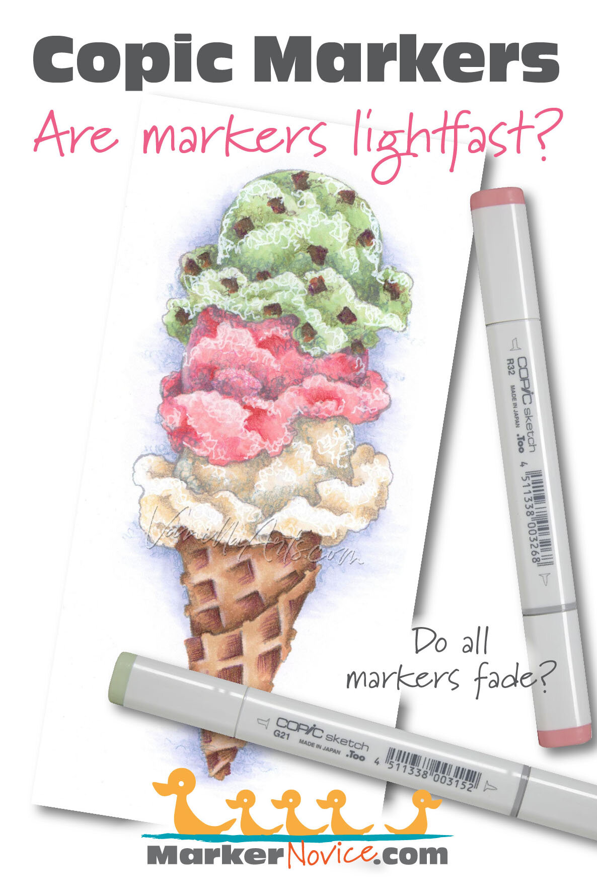
“Triple Scoop” a Copic Marker project with colored pencil and gouache details. Image and coloring by Amy Shulke of VanillaArts.com and MarkerNovice.com
Usually when someone purchases markers, they check to see they’re alcohol or water-based. (For more about the water vs. alcohol decision, see my article here.) Because alcohol markers are more expensive, we tend to think of them as being premium products; they’re supposedly much better than the average kiddie marker.
So we leap to conclusions, assuming premium markers are lightfast. After all, all the good card making and scrapbooking products are archival, the markers must be lightfast too, right?
Nope.
Art markers are made with dye and all dyes fade.
Some dyes fade fast, some fade slow but they all fade. As the colorful dye particles break down, the marker ink slowly discolors or disappears completely.
In textiles (fabrics), dye manufacturers have developed dyes which last much longer; but permanent dyes require pre-treatment and post-treatment— sometimes with high heat, sometimes with acids or chemical baths. Long lasting fabric dyes are simply not practical to use as marker ink.
Until there’s some great leap in dye technology, we’re stuck with illustration markers which use colors that fade.
—————
*The exception to dye markers was Winsor Newton Pigment Markers (now discontinued) which were made with pigment rather than dye. These markers were guaranteed to be lightfast for 100 years but they were not user friendly and clogged easily. This is typical of pigments, they’re more lightfast and often archival but pigment particles are large and not soluble in alcohol or water. Pigments make markers very finicky and inconsistent.
inks made with dye are fugitive
“Fugitive” is the artist’s term for a color which disappears.
All marker dyes are fugitive.
Fugitive color starts fading as soon as you apply it to the paper or other substrate.

Why do fugitive inks fade?
Marker inks fade because dye is an unstable chemical compound. It’s not durable or permanent. The molecules aren’t very happy to be joined together and they’ll use any excuse to separate.
Which conditions encourage dye to fade?
Light: most people assume it’s UV sunlight (ultraviolet radiation) which fades color the most, but florescent lights are just as bad. See my article here for an example of extreme Copic fading under florescent lights.
Humidity: have you noticed antique fabrics and paper in a museum are usually behind glass? Conservationists know that dyes fade faster in humid places. Even if the dye isn’t water soluble, dye particles stay structurally intact longer in low humidity environments.
Oxygen: speaking of museum glass cases, they’re not just controlling humidity. Museum cases are filled with a nitrogen or argon rich air blend, reducing the destabilizing effect of oxygen exposure.
Temperature: high temperatures, even gentle warming can damage the structural integrity of dye inks.
Acidic paper: non-archival paper not only turns yellow and brittle, the acids in paper create an inhospitable environment for dyes.
Time: this is the hardest thing for marker colorers to understand. Even if you store your marker project in ideal museum conditions, you still can’t stop the aging factor. Marker dyes are unstable, treat them perfectly and they’ll still break down over time.
How fast do Copic Markers fade?
Each dye has its own unique composition and structure; every color has its own durability and level of lightfastness.
From the Copic Website:
Q: Will artworks made with Copic fade over time?
A.Since we use dye ink, the colors may fade over time when exposed to strong UV light. It also depends on the specific color and the amount of light - some colors may start fading after several hours or days, while some may not change at all.
Marker formulas fade at different rates— sadly, consumers have never been given accurate product information on which colors fade, how fast they fade, and which colors are so fugitive that they’re pointless to use on long term projects.
Too, the parent company of Copic doesn’t seem bother with lightfast testing. If they do, they don’t share the test results. To be honest, I’d be shocked if they tested their inks; ASTM testing is expensive and it’s completely useless for products which begin to fade in a matter of hours.
Yes, I said “hours”… look at the quote (on the right) from the Copic website!
The lack of detailed lightfast information is why I started the Copics Uncapped series here at Marker Novice
At the bottom of the left side squares, you’ll find my miniature version of the Blue Wool testing method for inks and dyes. Read more information about the Blue Wool method here.
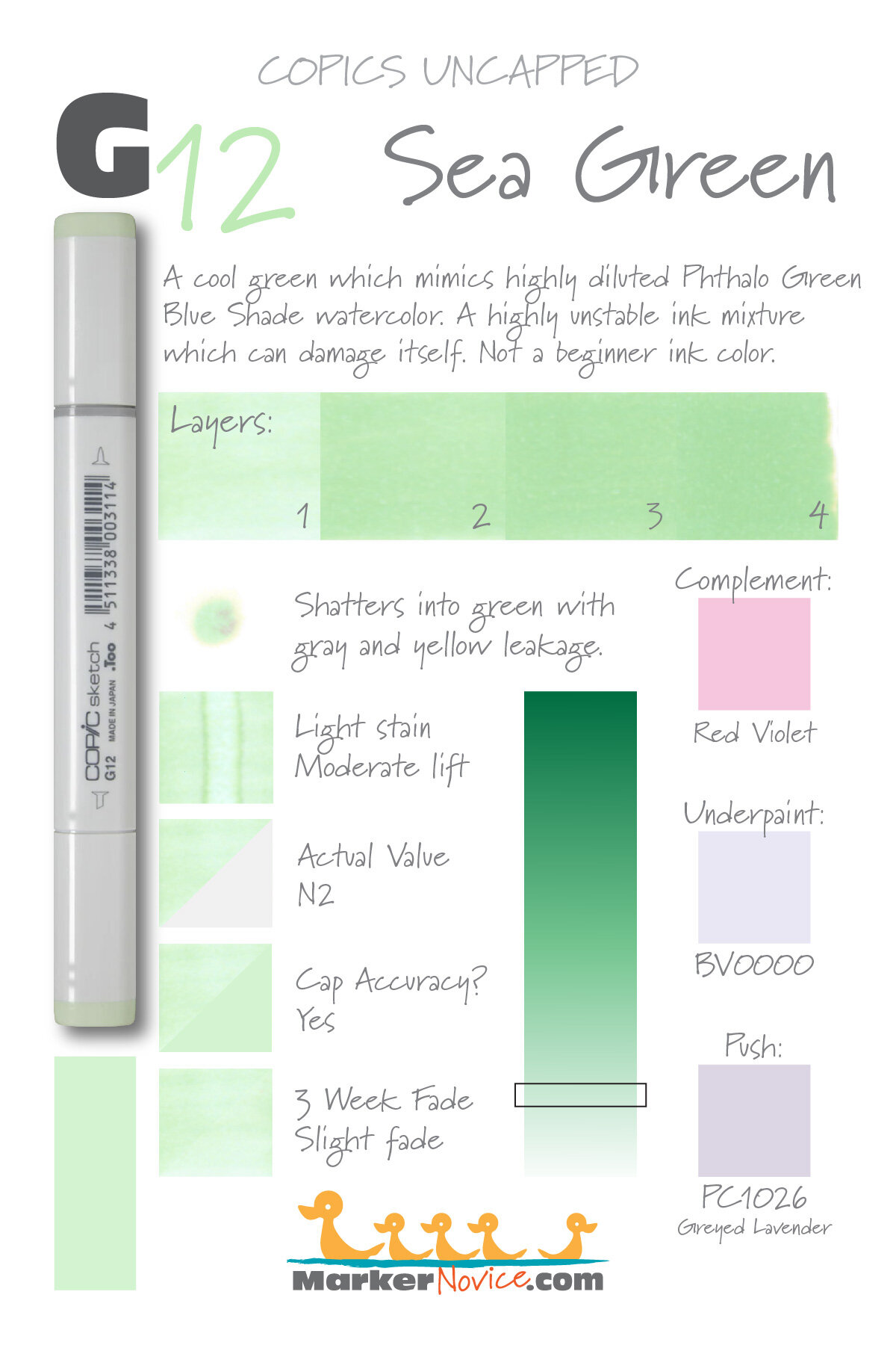


Because we already know Copics are not lightfast, the question isn’t if they fade. Instead, we want to know how much and how fast.
To provide a better look at how early the fade starts, I shortened the Blue Wool standard time from 3 months to 3 weeks.
Most Copic samples show noticeable results after just 2 weeks but I test an additional week to get a feel for how extreme the early fade will be.
Note: My testing is more casual than standardized Blue Wool testing. I run about 30 colors at a time because that’s how many can fit on my sunniest windowsill. Unfortunately, I can’t run 358 tests at once, so I give winter test swatches a little extra window time to make up for the lack of bright sunlight. It’s not precise but I’m giving you more information than Copic has ever provided.
This is also a solo project, so be patient. I publish a few new results each week as I assemble them.
As you browse through my test swatches here, you can see which colors fade immediately and which sit relatively unchanged for the full test period. A fast-fader is a color you may want to avoid if you intend to keep the project around for years.
But I’ve never noticed any fading!
There’s always someone in some online group who claims to be the exception to the rule.
“I don’t think you need to worry about markers fading. I’ve got a bunch of old projects and I don’t see any changes…”
They’re wrong.
The reason I test Copic lightfastness is to provide concrete evidence of the fade instead of listening to random internet strangers swear it doesn’t happen.
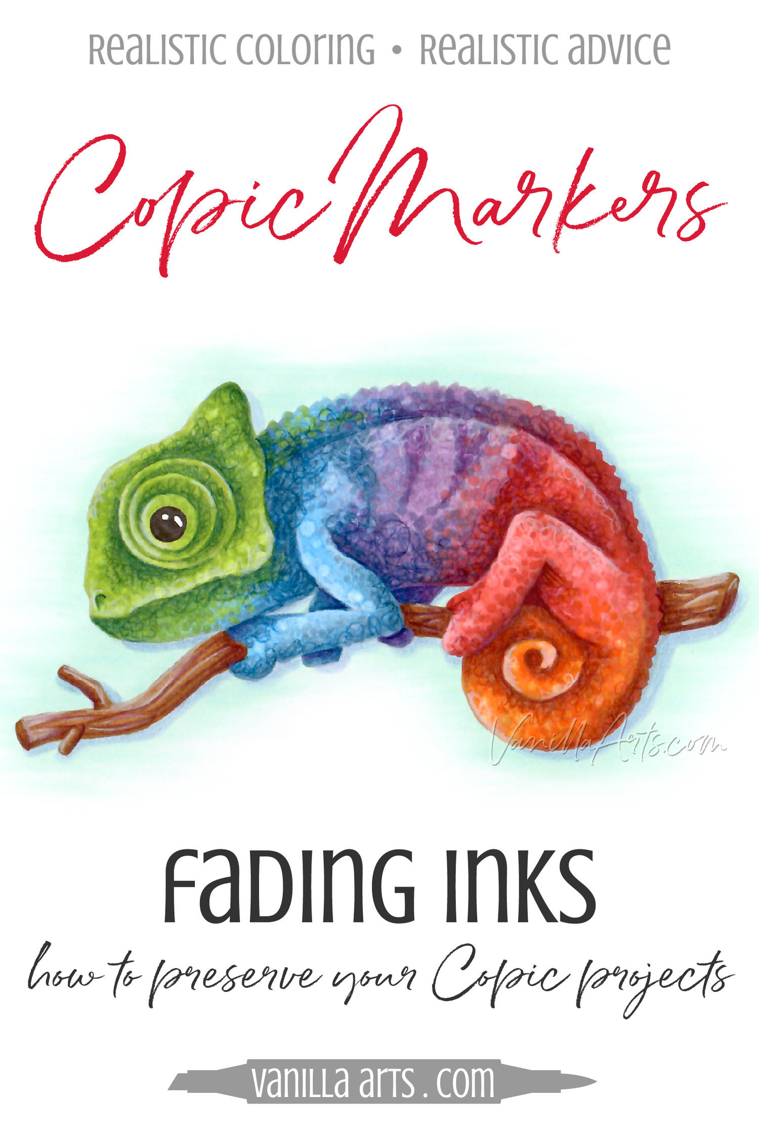
The fade isn’t always as striking as you see on my Chameleon project. The fade can be subtle.
I don’t usually notice general overall fading until I compare one of the project pics on my website to the original project in my hand.
And remember, the whole project is fading, not just one color in one spot. The human brain has a terrible memory for color, so if you’re looking at something everyday, you’re unlikely to notice a total decrease in overall vibrancy.
The people who can’t see the fade are not comparing befores and afters.

But artists know better! So why do use markers which fade?
Markers were never intended to make framable art.
When I mention to classes that Copic Markers are not lightfast, someone always asks:
“Oh no! I only use lightfast products! Which marker should I switch to?”

You can’t switch. The only lightfast marker (Winsor Newton Pigment Markers) were difficult to work with and I wasn’t surprised when they were discontinued.
I know this stinks. There are so many cool markers out there; it’s not fair that they fade! Why can’t we have lightfast markers?
Technology has its limits, this is one of them.
But here’s the issue I have with hobbyists who get angry about markers not being lightfast…
You’re walking into something with 10 minutes of experience and no knowledge of how professional artists use art markers.
Art markers were developed for illustrators and designers— artists like graphic and commercial artists, storyboard artists, fashion and interior designers, landscape designers and architects. Professionals use markers for idea brainstorming and fast visual communication between team members. We get an idea and we quickly scribble it on cheap paper, then we throw it away a few weeks later.
Markers are made for disposable art.
Artists need disposable art mediums. The fact that marker fades is not a design flaw, it’s an asset. Creative people use markers to spark creative ideas. For ideas to flow, you want to generate a lot of ideas, fast. We throw away the bad ideas and develop the good ideas into great ideas.
Markers are the artist’s version of a chalk board— the disposable transient nature of marker sketching encourages greater creativity.
When you enshrine an idea or a drawing as if it’s the best thing you’ve ever done or ever will do, you stifle further creativity.
Now I know, I’m a bit of a hypocrite. I teach advanced marker painting classes where we spend lots of time coloring extravagant projects which look like paintings. But I don’t expect anyone’s class project to hang on a museum wall. It’s an assignment, it’s an experiment, it’s practice— it’s not art.
If I were to create something truly amazing with markers, something worth keeping and framing, there’s a simple solution: Scan the project and have it professionally printed.
And honestly, if I think I’m onto something truly great, I don’t use markers. I use a lightfast medium on archival paper.
I don’t need or want a marker that lasts forever.
Tips for preserving Copic Marker art
I try to explain to students about the disposable nature of marker art and how your class projects are just exercises but students always ask…
“What if I really want to save my project? What can I use to prevent my marker project from fading?”
Best practices:
Work like a graphic artist: Always scan your fresh artwork at 600ppi and save the unedited original digital copy in at least 2 locations. I save my art to an exterior hard drive, an offsite server, and the cloud.
Archive your original marker projects: Keep your projects stored in archival boxes, separated by smooth (no folds) sheets of glassine, with desiccant packets taped to the lid box (not touching the artwork). Projects will still fade because you’re not controlling for oxygen inside the box (and the humidity control is iffy) but for the average colorer, I honestly think this is the best you can do.
To sell marker art or frame it for personal use: I have professional giclee prints made from the digital scans. Only sell prints; never sell marker originals. I know some people say “you can sell marker art if you warn the buyer” but I think this is dishonest. You can tell a customer the marker will fade but the truth of that statement doesn’t really sink in until the art fades and then they’re disappointed or mad at you. Only sell prints and keep your good reputation!
To hang framed artwork: Whether you’re hanging original Copic art behind UV glass, a giclee print, or even an oil painting, wall placement for art is incredibly important. Never hang ANY art across from a window where it will receive direct sunlight. Also never hang art in a bathroom or near kitchen appliances where temperature and humidity constantly rise and fall.
Products student ask about (and why I’m skeptical):
Storing projects in books, folders, portfolios: This isn’t a terrible idea, it does prevent UV fading and also keeps the artwork accessible for periodic viewing. Students enjoy flipping through my class samples in these portfolio books, but I do think archival boxes provide better overall protection.
Framing original marker art behind UV glass: Let’s be clear, not all UV glass is created equally. The quality and benefits of UV glass ranges from the cheap UV glass in standardized frames all the way up to museum quality sheet glass. UV glass works by bending UV rays away from your project. Better UV glass bends more rays but even the best glass can’t bend them all. No UV glass is totally protective and good UV glass looks exactly like plain old ordinary glass. I often wonder if the cheap imported frames at Hobby Mart are actually UV glass because nobody is Hobby Mart is checking!
Please note: if you’re framing something you love, spend the extra money for professional framing.
Professionals use a higher grade glass plus archival mats and spacers.
Framers understand how much space each medium needs between the surface of the art and the glass.
Professionals seal the back of the frame for added oxygen and humidity control.
Over the years, I’ve seen a ton of doomed self-framed projects which kiss the glass or rattle loose behind a mat. Framing art wrong can be worse than not framing it at all.
Sealing with UV protective spray fixative or varnish: USE EXTREME CAUTION! UV Archival Sprays like this usually employ alcohol or acetone as either propellant or solvent (MSDS sheet here). Alcohol is a big no-no for alcohol marker projects. Even as a propellant, alcohol sprays leave spots. I’ve tested acetone, it acts like bleach on Copic.
Aside from the solvent/propellant issues, UV sprays work like UV glass, bending light rays away from the artwork. Unlike glass, to be truly effective, varnish must be applied very evenly in several coats from multiple directions. Very few people take the time to learn how to varnish properly.
An alternative UV varnish: Brush-on Polymer Varnish like this might work for markers but it uses ammonia as the solvent and I’ve never tested ammonia on markers (MSDS here). I also wonder if ammonia can throw off the ph levels which dye needs to retain its structure. Golden is a brand I trust but honestly, this kind of varnishing is far more work than I’m interested in.
One recent thought I’ve had… they make UV plastic pouches for use with lamination machines (here’s one brand, here’s another from a similarly reputable brand). I’ve not tried the UV specific types but it seems like a good solution to UV which would also limit humidity and oxygen exposure at the same time. My concern is how much heat the lamination machine uses to bond the plastic to the artwork. Also, lamination is irreversible and unfixable. I’ve laminated a lot of class materials and they frequently leave bubbles… am I willing to risk my art? BTW, when I laminate color wheels and charts for classes, I use this thermal-lamination machine with these non-UV pouches.
To summarize:
It can be discouraging to invest time and money into Copic or other marker brands, only to find out how fast these markers fade.
The lack of lightfastness is something I wish more instructors would cover in their beginner classes and articles. But sadly, I suspect many coloring instructors don’t even realize markers are not lightfast. I’ve been talking about it in classes for years and I still encounter people every time who have never heard that markers are fugitive.
Copic Markers are not lightfast. All alcohol markers fade.
Markers use a combination of solvent and dye for inks that are vivid, bright and radiate color like stained glass. Unfortunately, dye is fugitive. Some fugitive colors last for only weeks while others stay vibrant for years but they all eventually fade.
Marker inks fade due to:
UV light rays from the sun and UV light rays from incandescent or florescent lightbulbs
Oxygen
Heat
Humidity
Ph imbalance with non-archival papers
Even just gradually over time
But this is not a new problem, permanent markers have never been as truly permanent as the name implies.
Graphic artists and designers understand the transitory nature of marker inks, enjoying markers for their color and the way they spark creativity. The temporary nature of a marker provides creative freedom and lessens the drive for perfection.
Markers are for play.
If it’s truly amazing work, then capture the magic in a digital scan and have your marker art professionally printed.
Or switch to a lightfast medium, once you’ve developed the idea with markers.
That’s the artist’s approach to markers— have fun and relax.
Not everything has to last forever.
Amy Shulke is a professional illustrator who has used Copic Markers since 1990. She teaches artistic coloring classes online at VanillaArts.com and locally in south-eastern Michigan.
Marker Novice is Amy’s completely free resource devoted to beginner marker education. For intermediate/advanced artistic coloring articles, see her Studio Journal here.

Further reading on related topics:


We all scream!
3 scoops of ice cream
Are you ready to customize a project? Pick your favorite flavors and color this tasty treat!
Amy Shulke’s "Triple Scoop"
Sample shown uses Copic Markers and Prismacolor colored pencils.
Package includes PNG digital stamp with easy print PDF option plus recipe, full color sample, photo reference, and grayscale guide.