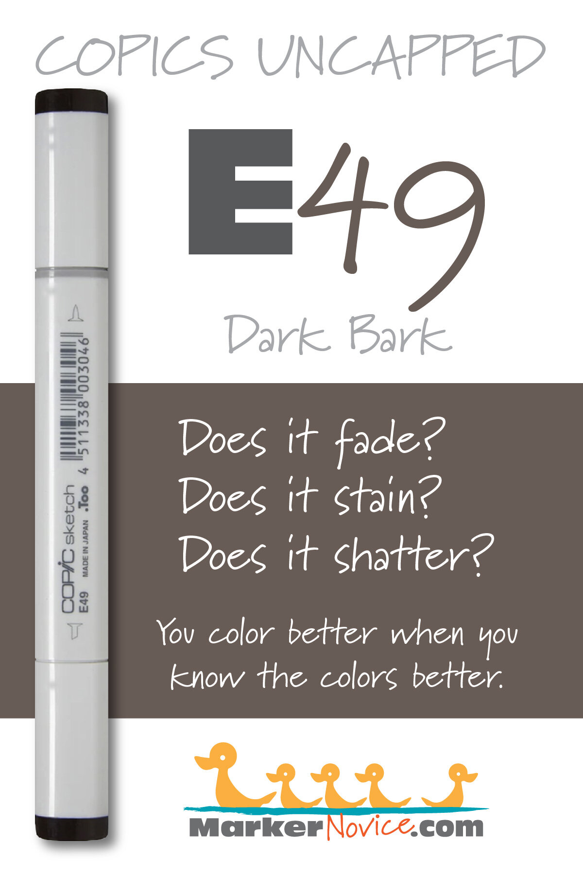
E39 Leather: Copics Uncapped (Marker Swatch, Ink Testing)
E39 Leather
Let’s take a closer look at this Copic Marker and it’s ink characteristics.


E39 Leather is a warm brown Copic Marker which closely resembles a warmer Burnt Umber watercolor. An easy blending, organic, all purpose brown. A recommended best buy for beginners. E39 is only available in Copic Sketch and Classic marker styles.
Every Copic Marker has unique characteristics based on its unique ink formula.
Knowing how a color behaves will help you blend effectively and make art with confidence.
E39 Leather
Let’s take a closer look at this Copic Marker and its ink characteristics.
Temperature: A warm brown.
Resemblance: Burnt Umber watercolor
Actual Value: N7
All Copics are measured on a Neutral Gray value scale. The last number on the cap is supposed to indicate value but we’ve found discrepancies where the actual ink value is different than cap designation.
Cap Accuracy: No. The plastic on a Sketch marker is darker than 5 coats of E39 ink. Beware, this marker is a lot lighter than you’d expect from the cap indicator.
Buildup: E39 starts to look oily on the second layer and never really smooths out until 5 coats at which point the color is excessively dark. It builds to maximum value at 5 layers.
Shattering: Does not shatter.
Chromatography testing shows this ink’s behavior when it comes in contact with #0 Colorless Blender (solvent). High shattering colors may leak unexpected color when you make corrections or attempt to blend with any color that has a high solvent to colorant ratio. Shattering is not bad, it’s just something to be aware of.
Staining: Stains the paper light brown.

Lift: This color does not lift much (which is not surprising from the darkest marker in any Copic number group).
See staining swatch. Sample was given 6 stripes of #0 Colorless Blender, drying between each stripe. Results indicate how much lifting you can expect.
Lightfast: We observed very minor fading during the test period.
Samples were swatched on X-Press It Blending Card. 1 layer of ink was exposed to windowsill sunlight for 21 days. Approximately 10 hours of sun per day based on weather conditions. Note: we do not recommend displaying original Copic art under these conditions.
Natural Ink Family: E39 is in the darkest of the E-Thirty family. This family of browns feel warmer as the color gets darker.
Family Members: E30, E31, E33. E34, E35, E37, and E39
We include this information because many Copic users never think deeper than the letter groupings (R, BV, G, etc.). Every ink has its own temperature variations and underlying flavors. Understanding what an ink looks like in its different dilutions helps when creating your own blending combinations.
Complement: Brown is not a hue on the color wheel and does not have a complement.
Underpaint: BV02 neutralizes this color well.
This is simply one suggestion. Many possible colors exist. Test to find a color that pleases you.
Pushing Pencil: Prismacolor 1076 90% French Grey pushes this color nicely.
VanillaArts.com (our sister site) teaches a Push & Pull technique for dimensional coloring. This is simply one suggestion. Many possible colors exist. Test to find a color that pleases you.
Vanilla Arts Classes using E39:
Box of Colors (Marker Painting Foundations 2) is a four episode Copic + Colored Pencil challenge for graduates of MPF. Covers color theory and form sculpting with group feedback. For more information: Box of Colors.

Chocolate Box: Amy shows you how to create darker colors than Copic makes, essential to creating realistic deep dark areas. Find more info here.
Vanilla Arts Digi Stamps using E39:
We continue to create new content and stamps and we will update here as more become available.
Visit the stamp shop page at our sister site VanillaArts.com for a wide variety of digi stamps.
Color palettes and swatches using E39:
We are building our palette and swatch collection a little more each week and will update here as more become available.
Visit the color resource page at our sister site VanillaArts.com for a wide variety of Copic palettes and swatches.
Looking for beautiful color palettes?
We absolutely love The Color Catalog 1 & 2 from Sarah Renae Clark. It puts hundreds of Copic friendly color palettes at your fingertips.
(note: affiliate link)












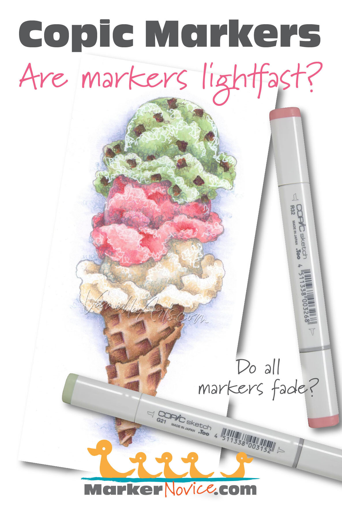


E35 Chamois: Copics Uncapped (Marker Swatch, Ink Testing)
E35 Chamois
Let’s take a closer look at this Copic Marker and it’s ink characteristics.
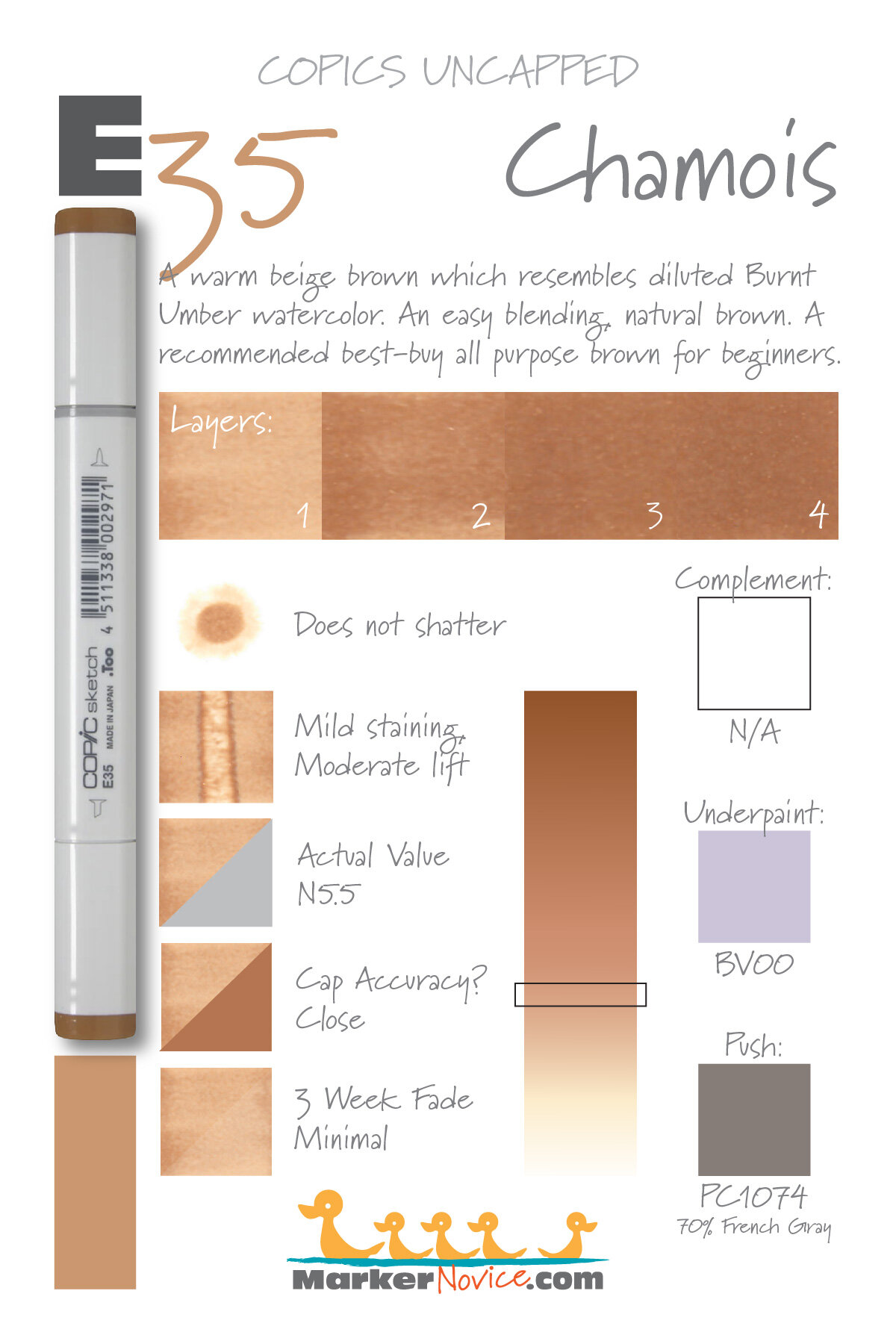
E35 Chamois is a warm beige brown Copic Marker which resembles diluted Burnt Umber watercolor. An easy blending, natural brown. A recommended best buy for beginners. E35 is available in Copic Sketch, Ciao, and Classic marker styles.
Every Copic Marker has unique characteristics based on its unique ink formula.
Knowing how a color behaves will help you blend effectively and make art with confidence.
E35 Chamois
Let’s take a closer look at this Copic Marker and its ink characteristics.
Temperature: A warm beige brown.
Resemblance: Diluted Burnt Umber watercolor
Actual Value: N5.5
All Copics are measured on a Neutral Gray value scale. The last number on the cap is supposed to indicate value but we’ve found discrepancies where the actual ink value is different than cap designation.
Cap Accuracy: Close. The plastic on a Sketch marker matches 3 coats of E35 ink.
Buildup: E35 layers well and builds to maximum value at 3 layers.
Shattering: Does not shatter.
Chromatography testing shows this ink’s behavior when it comes in contact with #0 Colorless Blender (solvent). High shattering colors may leak unexpected color when you make corrections or attempt to blend with any color that has a high solvent to colorant ratio. Shattering is not bad, it’s just something to be aware of.
Staining: Stains the paper with a slight bit of yellow which doesn’t seem to fully move.

Lift: You can lift some of this color but the paper remains stained.
See staining swatch. Sample was given 6 stripes of #0 Colorless Blender, drying between each stripe. Results indicate how much lifting you can expect.
Lightfast: We observed very minor fading during the test period.
Samples were swatched on X-Press It Blending Card. 1 layer of ink was exposed to windowsill sunlight for 21 days. Approximately 10 hours of sun per day based on weather conditions. Note: we do not recommend displaying original Copic art under these conditions.
Natural Ink Family: E35 is in the middle of the E-Thirty family. This family of browns feel warmer as the color gets darker.
Family Members: E30, E31, E33. E34, E35, E37, and E39
We include this information because many Copic users never think deeper than the letter groupings (R, BV, G, etc.). Every ink has its own temperature variations and underlying flavors. Understanding what an ink looks like in its different dilutions helps when creating your own blending combinations.
Complement: Brown is not a hue on the color wheel and does not have a complement.
Underpaint: BV00 neutralizes this color well.
This is simply one suggestion. Many possible colors exist. Test to find a color that pleases you.
Pushing Pencil: Prismacolor 1074 70% French Grey pushes this color nicely.
VanillaArts.com (our sister site) teaches a Push & Pull technique for dimensional coloring. This is simply one suggestion. Many possible colors exist. Test to find a color that pleases you.
Vanilla Arts Classes using E35:
Expressive Sunflowers: a revolutionary lesson on dimension, introducing the concept of color sculpting. Learn to use your chisel nib to color sculpt. Find more info here.

Robin’s Nest: A lesson on building up realistic texture using freehand strokes. Find more info here.
Chocolate Box: Amy shows you how to create darker colors than Copic makes, essential to creating realistic deep dark areas. Find more info here.
Vanilla Arts Digi Stamps using E35:
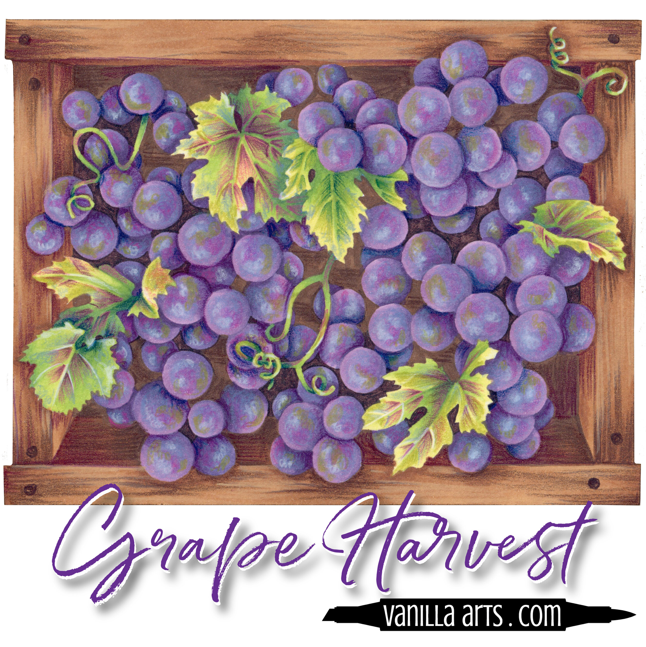
Color palettes and swatches using E35:
We are building our palette and swatch collection a little more each week and will update here as more become available.
Visit the color resource page at our sister site VanillaArts.com for a wide variety of Copic palettes and swatches.
Looking for beautiful color palettes?
We absolutely love The Color Catalog 1 & 2 from Sarah Renae Clark. It puts hundreds of Copic friendly color palettes at your fingertips.
(note: affiliate link)


E31 Brick Beige: Copics Uncapped (Marker Swatch, Ink Testing)
E31 Brick Beige
Let’s take a closer look at this Copic Marker and it’s ink characteristics.
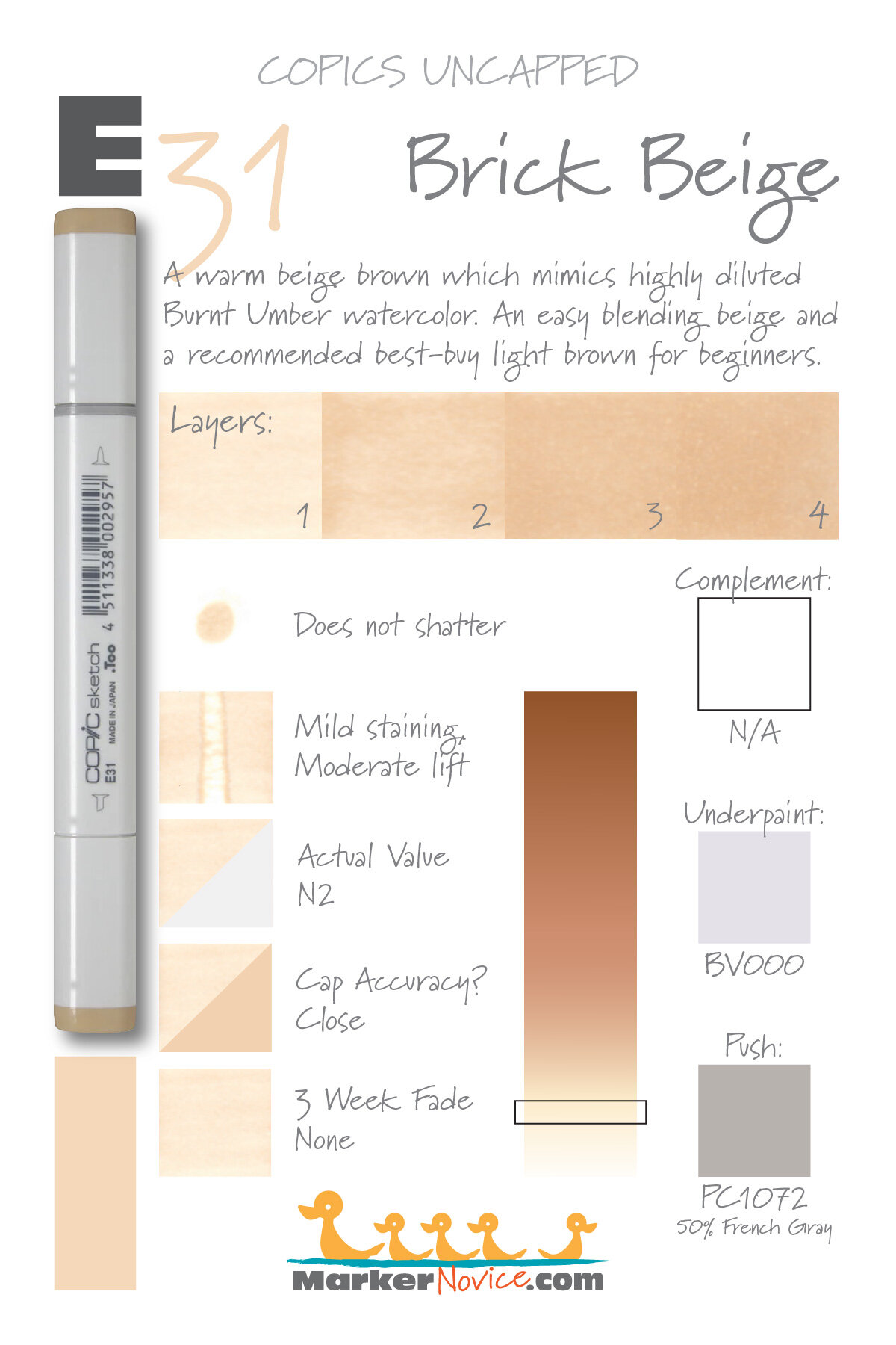
E31 Brick Beige is a warm beige brown Copic Marker which resembles highly diluted Burnt Umber watercolor. An easy blending beige; a recommended best buy for beginners. E31 is available in Copic Sketch, Ciao, and Classic marker styles.
Every Copic Marker has unique characteristics based on its unique ink formula.
Knowing how a color behaves will help you blend effectively and make art with confidence.
E31 Brick Beige
Let’s take a closer look at this Copic Marker and its ink characteristics.
Temperature: A warm beige brown.
Resemblance: Highly diluted Burnt Umber watercolor
Actual Value: N2
All Copics are measured on a Neutral Gray value scale. The last number on the cap is supposed to indicate value but we’ve found discrepancies where the actual ink value is different than cap designation.
Cap Accuracy: Close. The plastic on a Sketch marker matches 3-4 coats of E31 ink.
Buildup: E31 layers well and builds to maximum value at 3 layers.
Shattering: Does not shatter.
Chromatography testing shows this ink’s behavior when it comes in contact with #0 Colorless Blender (solvent). High shattering colors may leak unexpected color when you make corrections or attempt to blend with any color that has a high solvent to colorant ratio. Shattering is not bad, it’s just something to be aware of.

Staining: Stains the paper with a slight bit of yellow which doesn’t seem to fully move.
Lift: You can lift most of this color but it’s definitely not erasable.
See staining swatch. Sample was given 6 stripes of #0 Colorless Blender, drying between each stripe. Results indicate how much lifting you can expect.
Lightfast: We observed no fading during the test period.
Samples were swatched on X-Press It Blending Card. 1 layer of ink was exposed to windowsill sunlight for 21 days. Approximately 10 hours of sun per day based on weather conditions. Note: we do not recommend displaying original Copic art under these conditions.
Natural Ink Family: E31 is at the light end of the E-Thirty family. This family of browns feel warmer as the color gets darker.
Family Members: E30, E31, E33. E34, E35, E37, and E39.
We include this information because many Copic users never think deeper than the letter groupings (R, BV, G, etc.). Every ink has its own temperature variations and underlying flavors. Understanding what an ink looks like in its different dilutions helps when creating your own blending combinations.
Complement: Brown is not a hue on the color wheel and does not have a complement.
Underpaint: BV000 neutralizes this color well.
This is simply one suggestion. Many possible colors exist. Test to find a color that pleases you.
Pushing Pencil: Prismacolor 1072 50% French Grey pushes this color nicely.
VanillaArts.com (our sister site) teaches a Push & Pull technique for dimensional coloring. This is simply one suggestion. Many possible colors exist. Test to find a color that pleases you.
Vanilla Arts Classes using E31:

Celebration Cupcake: Soft fluffy frosting and tasty cake, perfect for any birthday celebration. Color gentle waves of frosting & crisply folded pleats. Find more info here.

Tonic: Amy covers the entire parchment technique and coloring authentic texture for realistic glass. Find more info here.
Vanilla Arts Digi Stamps using E31:
Color palettes and swatches using E31:


Looking for beautiful color palettes?
We absolutely love The Color Catalog 1 & 2 from Sarah Renae Clark. It puts hundreds of Copic friendly color palettes at your fingertips.
(note: affiliate link)

E21 Soft Sun: Copics Uncapped (Marker Swatch, Ink Testing)
E21 Soft Sun
Let’s take a closer look at this Copic Marker and it’s ink characteristics.

E21 Soft Sun is a warm brown Copic Marker which resembles highly diluted Burnt Umber watercolor. Often used for skin, we recommend caution as the blending process makes E21 skin look orange. E21 is available in Copic Sketch, Ciao, and Classic marker styles.
Every Copic Marker has unique characteristics based on its unique ink formula.
Knowing how a color behaves will help you blend effectively and make art with confidence.
E21 Soft Sun
Let’s take a closer look at this Copic Marker and its ink characteristics.
Note: This Copic Marker color has been renamed. Older markers may be marked “Baby Skin Pink”
Temperature: A warm brown (likely due to the effects of high solvent in this ink formula)
Resemblance: Highly diluted Burnt Umber watercolor
Actual Value: N2
All Copics are measured on a Neutral Gray value scale. The last number on the cap is supposed to indicate value but we’ve found discrepancies where the actual ink value is different than cap designation.
Cap Accuracy: Yes, the plastic on a Sketch marker matches 1 coat of E21
Buildup: E21 reaches maximum color at 4 layers. There are signs of oiliness at 2 layers which evens itself out at 4 layers.
Shattering: Does not shatter.
Chromatography testing shows this ink’s behavior when it comes in contact with #0 Colorless Blender (solvent). High shattering colors may leak unexpected color when you make corrections or attempt to blend with any color that has a high solvent to colorant ratio. Shattering is not bad, it’s just something to be aware of.

Staining: Mildly staining, leaves paper with a slight golden color.
Lift: Easily lifts but the paper stain may not disappear.
See staining swatch. Sample was given 6 stripes of #0 Colorless Blender, drying between each stripe. Results indicate how much lifting you can expect.
Lightfast: No visible fading during the test period
Samples were swatched on X-Press It Blending Card. 1 layer of ink was exposed to windowsill sunlight for 21 days. Approximately 10 hours of sun per day based on weather conditions. Note: we do not recommend displaying original Copic art under these conditions.
Natural Ink Family: E21 is the lightest ink from the the E-Twenty family which runs from E21 on the pale end to this rich, dark, chocolate brown.
Family Members: E21, E23, E25. E27, and E29
We include this information because many Copic users never think deeper than the letter groupings (R, BV, G, etc.). Every ink has its own temperature variations and underlying flavors. Understanding what an ink looks like in its different dilutions helps when creating your own blending combinations.
Complement: Brown is not a hue on the color wheel and does not have a complement.
Underpaint: B60 neutralizes this color well.
This is simply one suggestion. Many possible colors exist. Test to find a color that pleases you.
Pushing Pencil: Prismacolor 1082 Chocolate pushes this color nicely.
VanillaArts.com (our sister site) teaches a Push & Pull technique for dimensional coloring. This is simply one suggestion. Many possible colors exist. Test to find a color that pleases you.
Vanilla Arts Classes using E21:
We continue to create new content and classes and we will update here as more become available.
Visit the workshop resource page at our sister site VanillaArts.com for a wide variety of Copic classes.
Vanilla Arts Digi Stamps using E21:
We continue to create new content and stamps and we will update here as more become available.
Visit the Stamp Shop resource page at our sister site VanillaArts.com for a wide variety of Vanilla Arts stamps.
Color palettes and swatches using E21:
We are building our palette and swatch collection a little more each week and will update here as more become available.
Visit the color resource page at our sister site VanillaArts.com for a wide variety of Copic palettes and swatches.
Looking for beautiful color palettes?
We absolutely love The Color Catalog 1 & 2 from Sarah Renae Clark. It puts hundreds of Copic friendly color palettes at your fingertips.
(note: affiliate link)


E13 Light Suntan: Copics Uncapped (Marker Swatch, Ink Testing)
E13 Light Suntan
Let’s take a closer look at this Copic Marker and it’s ink characteristics.
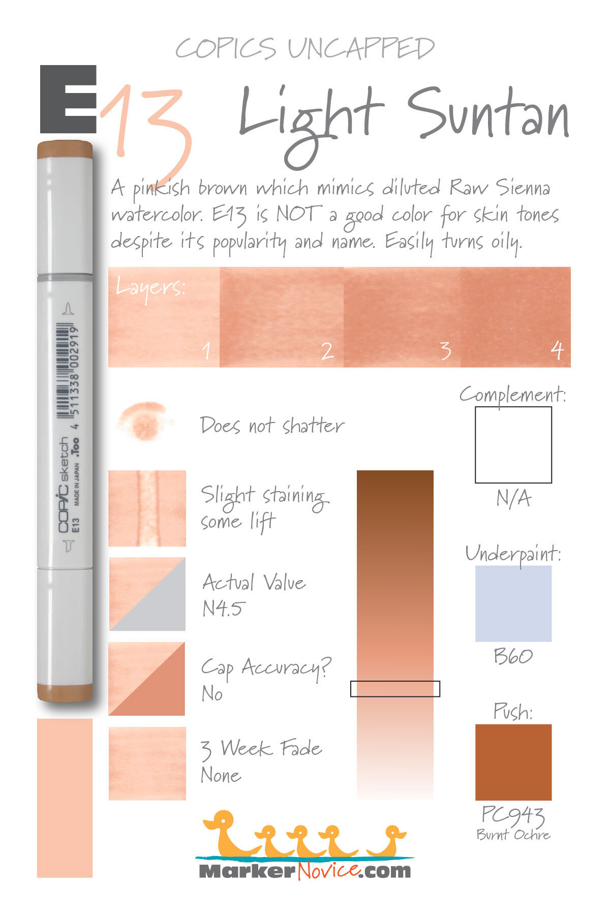
E13 Light Suntan is a pinkish brown Copic Marker which resembles diluted Raw Sienna watercolor. E13 is not a good color for skin tones despite its popularity and name. E13 is only available in Copic Sketch, and Classic marker styles.
Every Copic Marker has unique characteristics based on its unique ink formula.
Knowing how a color behaves will help you blend effectively and make art with confidence.
E13 Light Suntan
Let’s take a closer look at this Copic Marker and its ink characteristics.
WARNING: This marker is incredibly popular for coloring skin tones. We DO NOT RECOMMEND coloring anyone’s skin with E13. One coat of E13 is more orange or pink than most skin tones and when was the last time you colored skin with only one coat of one marker? Look at how unnaturally orange E13 looks with two or more coats. E13 is perfect for terra cotta pots but skin? It’s not what you think.
Temperature: A warm pinkish brown.
Resemblance: Resembles diluted Raw Sienna watercolor (one of the redder Raw Siennas, many are more yellowish).
Actual Value: N4.5
All Copics are measured on a Neutral Gray value scale. The last number on the cap is supposed to indicate value but we’ve found discrepancies where the actual ink value is different than cap designation.
Cap Accuracy: The plastic indicator on a Sketch marker is misleading. The caps are darker than 4 coats of E13 ink.
Buildup: E13 can turn oily looking on the first layer. This is another negative issue when coloring skin tones because people tend to blend skin a lot more, trying to get a super-smooth finish. E13 is much closer to the color of a terra cotta pot than skin.
Shattering: Does not shatter.
Chromatography testing shows this ink’s behavior when it comes in contact with #0 Colorless Blender (solvent). High shattering colors may leak unexpected color when you make corrections or attempt to blend with any color that has a high solvent to colorant ratio. Shattering is not bad, it’s just something to be aware of.

Staining: Slightly staining. Typical of an ink with a bit of red in the formula.
Lift: Stubborn. The ink can be lightened but the paper remains pinkish brown.
See staining swatch. Sample was given 6 stripes of #0 Colorless Blender, drying between each stripe. Results indicate how much lifting you can expect.
Lightfast: E13 did not fade during our test period.
Samples were swatched on X-Press It Blending Card. 1 layer of ink was exposed to windowsill sunlight for 21 days. Approximately 10 hours of sun per day based on weather conditions. Note: we do not recommend displaying original Copic art under these conditions.
Natural Ink Family: E13 sits at the light end of the E-Teen family which runs from E11 to E19 on the far end. Beware of the marker caps, many caps in this family are extremely misleading.
Family Members: E11, E13, E15. E17, E18, E19
We include this information because many Copic users never think deeper than the letter groupings (R, BV, G, etc.). Every ink has its own temperature variations and underlying flavors. Understanding what an ink looks like in its different dilutions helps when creating your own blending combinations.
Complement: Brown is not a hue on the colorwheel and does not have a complement.
Underpaint: B60 neutralizes this color well.
This is simply one suggestion. Many possible colors exist. Test to find a color that pleases you.
Pushing Pencil: Prismacolor 943 Burnt Ochre is very pretty over E11 but keep the pressure soft and the color light.
VanillaArts.com (our sister site) teaches a Push & Pull technique for dimensional coloring. This is simply one suggestion. Many possible colors exist. Test to find a color that pleases you.
Vanilla Arts Classes using E13:
We continue to create new content and classes and we will update here as more become available.
Visit the workshop resource page at our sister site VanillaArts.com for a wide variety of Copic & colored pencil classes.
Vanilla Arts Digi Stamps using E13:
We continue to create new content and stamps and we will update here as more become available.
Visit the Stamp Shop resource page at our sister site VanillaArts.com for a wide variety of Vanilla Arts stamps.
Color palettes and swatches using E13:
We are building our palette and swatch collection a little more each week and will update here as more become available.
Visit the color resource page at our sister site VanillaArts.com for a wide variety of Copic palettes and swatches.
Looking for beautiful color palettes?
We absolutely love The Color Catalog 1 & 2 from Sarah Renae Clark. It puts hundreds of Copic friendly color palettes at your fingertips.
(note: affiliate link)

E11 Barley Beige: Copics Uncapped (Marker Swatch, Ink Testing)
E11 Barley Beige
Let’s take a closer look at this Copic Marker and it’s ink characteristics.

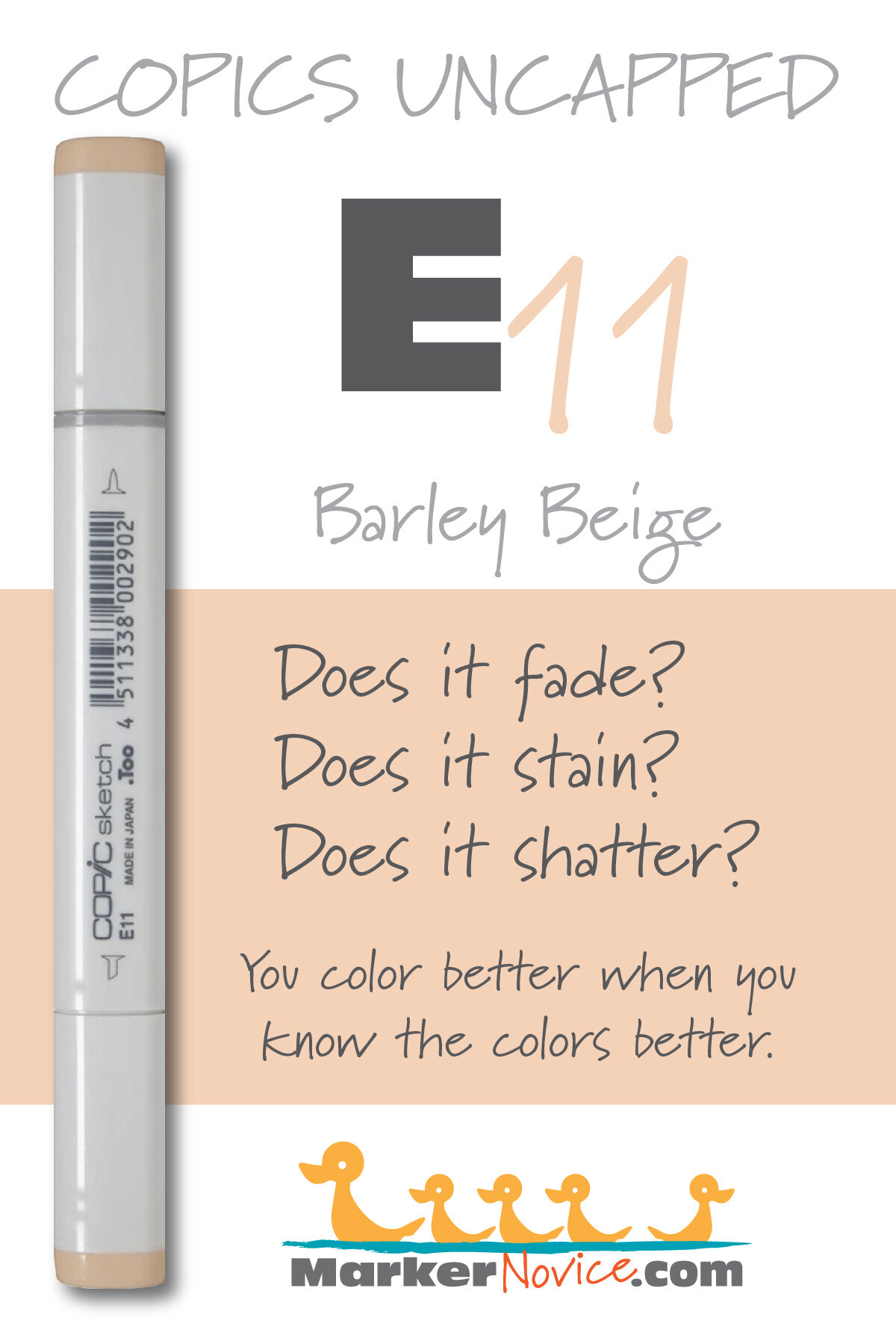
E11 Barley Beige is a warm brown Copic Marker which resembles diluted Raw Sienna watercolor. It is popular for skin tones but it’s not a realistic skin color. Good for general illustration. E11 is available in Copic Sketch, Ciao, and Classic marker styles.
Every Copic Marker has unique characteristics based on its unique ink formula.
Knowing how a color behaves will help you blend effectively and make art with confidence.
E11 Barley Beige
Let’s take a closer look at this Copic Marker and its ink characteristics.
WARNING: This marker is incredibly popular for coloring skin tones. We DO NOT RECOMMEND coloring anyone’s skin with E11. One coat of E11 does look a bit like some caucasian skin but when was the last time you colored skin with only one coat of one marker? Look at how unnaturally orange E11 looks with two or more coats. Nobody has skin this color!
Temperature: A warm brown.
Resemblance: Resembles diluted Raw Sienna watercolor (one of the redder Raw Siennas, many are more yellowish).
Actual Value: N3
All Copics are measured on a Neutral Gray value scale. The last number on the cap is supposed to indicate value but we’ve found discrepancies where the actual ink value is different than cap designation.
Cap Accuracy: The plastic indicator on a Sketch marker matches 1 coat of E11 ink.
Buildup: E11 can turn oily looking with just 2 layers. This is another negative issue when coloring skin tones because people tend to blend skin a lot more, trying to get a super-smooth finish. E11 simply gets too dark, too orange, and too oily to be a good skin color.
Shattering: Does not shatter.
Chromatography testing shows this ink’s behavior when it comes in contact with #0 Colorless Blender (solvent). High shattering colors may leak unexpected color when you make corrections or attempt to blend with any color that has a high solvent to colorant ratio. Shattering is not bad, it’s just something to be aware of.

Staining: Slightly staining. Typical of an ink with red in the formula.
Lift: Stubborn. The ink can be lightened but the paper remains pinkish brown.
See staining swatch. Sample was given 6 stripes of #0 Colorless Blender, drying between each stripe. Results indicate how much lifting you can expect.
Lightfast: Just a hint of fading, less than 5%.
Samples were swatched on X-Press It Blending Card. 1 layer of ink was exposed to windowsill sunlight for 21 days. Approximately 10 hours of sun per day based on weather conditions. Note: we do not recommend displaying original Copic art under these conditions.
Natural Ink Family: E11 sits at the light end of the E-Teen family which runs from E11 to E19 on the far end. Beware of the marker caps, many caps in this family are extremely misleading.
Family Members: E11, E13, E15. E17, E18, E19
We include this information because many Copic users never think deeper than the letter groupings (R, BV, G, etc.). Every ink has its own temperature variations and underlying flavors. Understanding what an ink looks like in its different dilutions helps when creating your own blending combinations.
Complement: Brown is not a hue on the colorwheel and does not have a complement.
Underpaint: B60 neutralizes this color well.
This is simply one suggestion. Many possible colors exist. Test to find a color that pleases you.
Pushing Pencil: Prismacolor 943 Burnt Ochre is very pretty over E11 but keep the pressure soft and the color light.
VanillaArts.com (our sister site) teaches a Push & Pull technique for dimensional coloring. This is simply one suggestion. Many possible colors exist. Test to find a color that pleases you.
Vanilla Arts Classes using E11:
We continue to create new content and classes and we will update here as more become available.
Visit the workshop resource page at our sister site VanillaArts.com for a wide variety of Copic classes.
Vanilla Arts Digi Stamps using E11:
We continue to create new content and classes and we will update here as more become available.
Visit the workshop resource page at our sister site VanillaArts.com for a wide variety of Vanilla Arts stamps.
Color palettes and swatches using E11:
We are building our palette and swatch collection a little more each week and will update here as more become available.
Visit the color resource page at our sister site VanillaArts.com for a wide variety of Copic palettes and swatches.
Looking for beautiful color palettes?
We absolutely love The Color Catalog 1 & 2 from Sarah Renae Clark. It puts hundreds of Copic friendly color palettes at your fingertips.
(note: affiliate link)

E07 Light Mahogany: Copics Uncapped (Marker Swatch, Ink Testing)
E07 Light Mahogany
Let’s take a closer look at this Copic Marker and it’s ink characteristics.
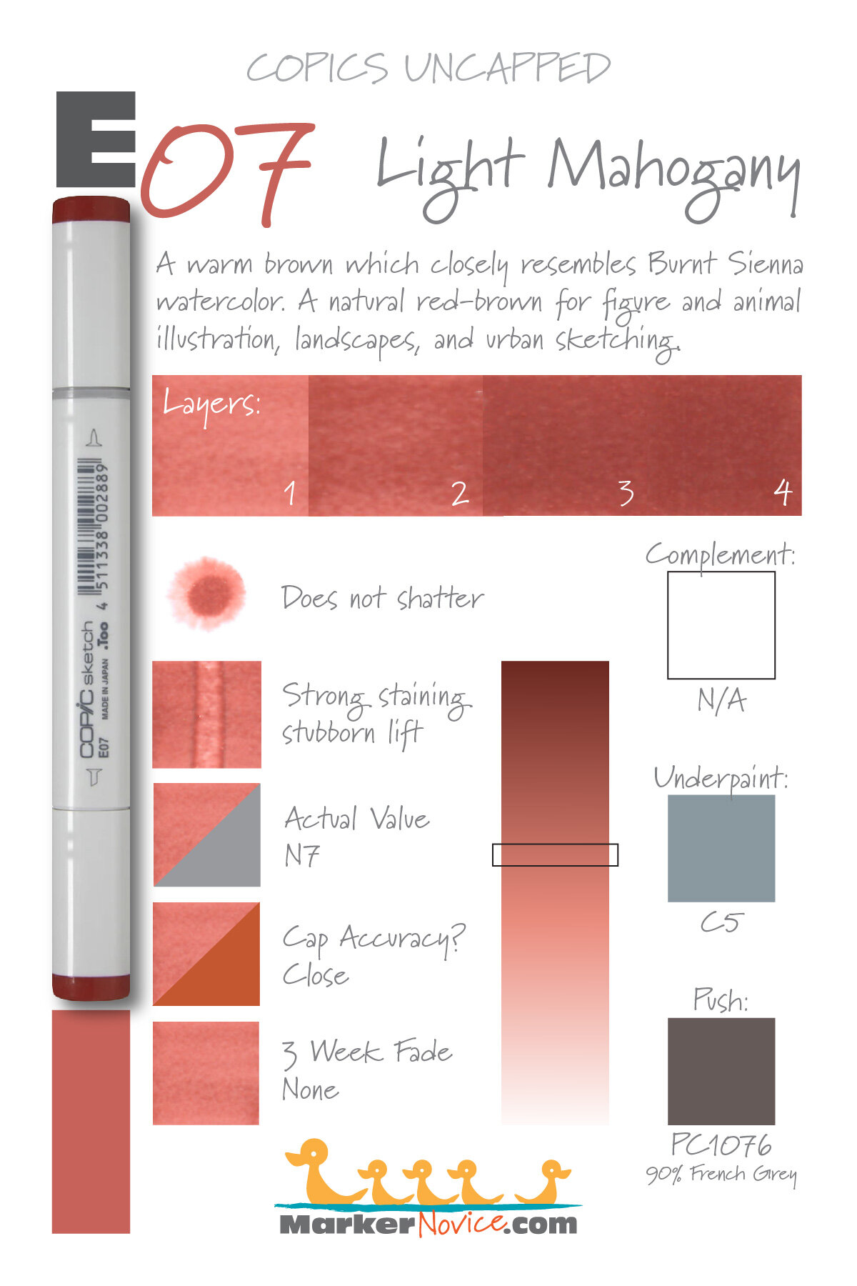
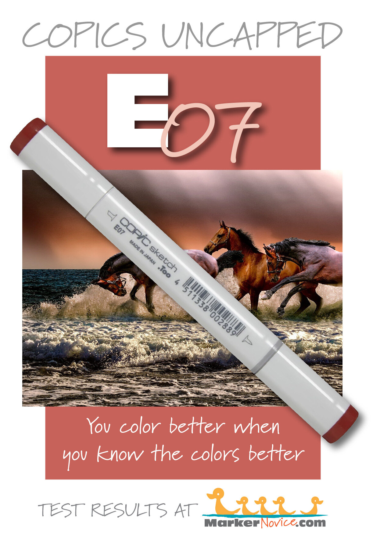
E07 is a warm brown Copic Marker which closely resembles Burnt Sienna watercolor. A natural brown for figure and animal illustration, landscapes, and urban sketching. E07 is only available in Copic Sketch and Classic marker styles.
Every Copic Marker has unique characteristics based on its unique ink formula.
Knowing how a color behaves will help you blend effectively and make art with confidence.
E07 Light Mahogany
Let’s take a closer look at this Copic Marker and its ink characteristics.
Temperature: A warm brown
Resemblance: Burnt Sienna Watercolor
Actual Value: N7
All Copics are measured on a Neutral Gray value scale. The last number on the cap is supposed to indicate value but we’ve found discrepancies where the actual ink value is different than cap designation.
Cap Accuracy: The plastic on a Sketch marker is close in value to 2 coats of E07 ink but is slightly warmer in temperature.
Buildup: E07 starts to develop oily blotches with the first coat. Reaches maximum value at 3-4 coats.
Shattering: Does not shatter.
Chromatography testing shows this ink’s behavior when it comes in contact with #0 Colorless Blender (solvent). High shattering colors may leak unexpected color when you make corrections or attempt to blend with any color that has a high solvent to colorant ratio. Shattering is not bad, it’s just something to be aware of.
Staining: Strongly staining.
Lift: This color color is stubborn and does not lift much.
See staining swatch. Sample was given 6 stripes of #0 Colorless Blender, drying between each stripe. Results indicate how much lifting you can expect.
Lightfast: We observed no fading during the test period.
Samples were swatched on X-Press It Blending Card. 1 layer of ink was exposed to windowsill sunlight for 21 days. Approximately 10 hours of sun per day based on weather conditions. Note: we do not recommend displaying original Copic art under these conditions.
Natural Ink Family: E07 is at the darker end of the E-Zero family and all are distinctly reddish browns with the palest end looking almost pink.
Family Members: E0000, E000, E00, E01, E02, E04, E07, E08, E09
We include this information because many Copic users never think deeper than the letter groupings (R, BV, G, etc.). Every ink has its own temperature variations and underlying flavors. Understanding what an ink looks like in its different dilutions helps when creating your own blending combinations.
Complement: Brown is not a hue on the color wheel and does not have a complement.
Underpaint: C5 neutralizes this color well.
This is simply one suggestion. Many possible colors exist. Test to find a color that pleases you.
Pushing Pencil: Prismacolor 1076 90% French Grey pushes this color nicely.
VanillaArts.com (our sister site) teaches a Push & Pull technique for dimensional coloring. This is simply one suggestion. Many possible colors exist. Test to find a color that pleases you.
Vanilla Arts Classes using E07:
We continue to create new content and classes and we will update here as more become available.
Visit the workshop resource page at our sister site VanillaArts.com for a wide variety of Copic classes.
Vanilla Arts Digi Stamps using E07:
We continue to create new content and stamps and we will update here as more become available.
Visit the stamp shop at our sister site VanillaArts.com for a wide variety of Copic classes.
Color palettes and swatches using E07:
We are building our palette and swatch collection a little more each week and will update here as more become available.
Visit the color resource page at our sister site VanillaArts.com for a wide variety of Copic palettes and swatches.
Looking for beautiful color palettes?
We absolutely love The Color Catalog 1 & 2 from Sarah Renae Clark. It puts hundreds of Copic friendly color palettes at your fingertips.
(note: affiliate link)


E49 Dark Bark: Copics Uncapped (Marker Swatch, Ink Testing)
E49 Dark Bark
Let’s take a closer look at this Copic Marker and it’s ink characteristics.
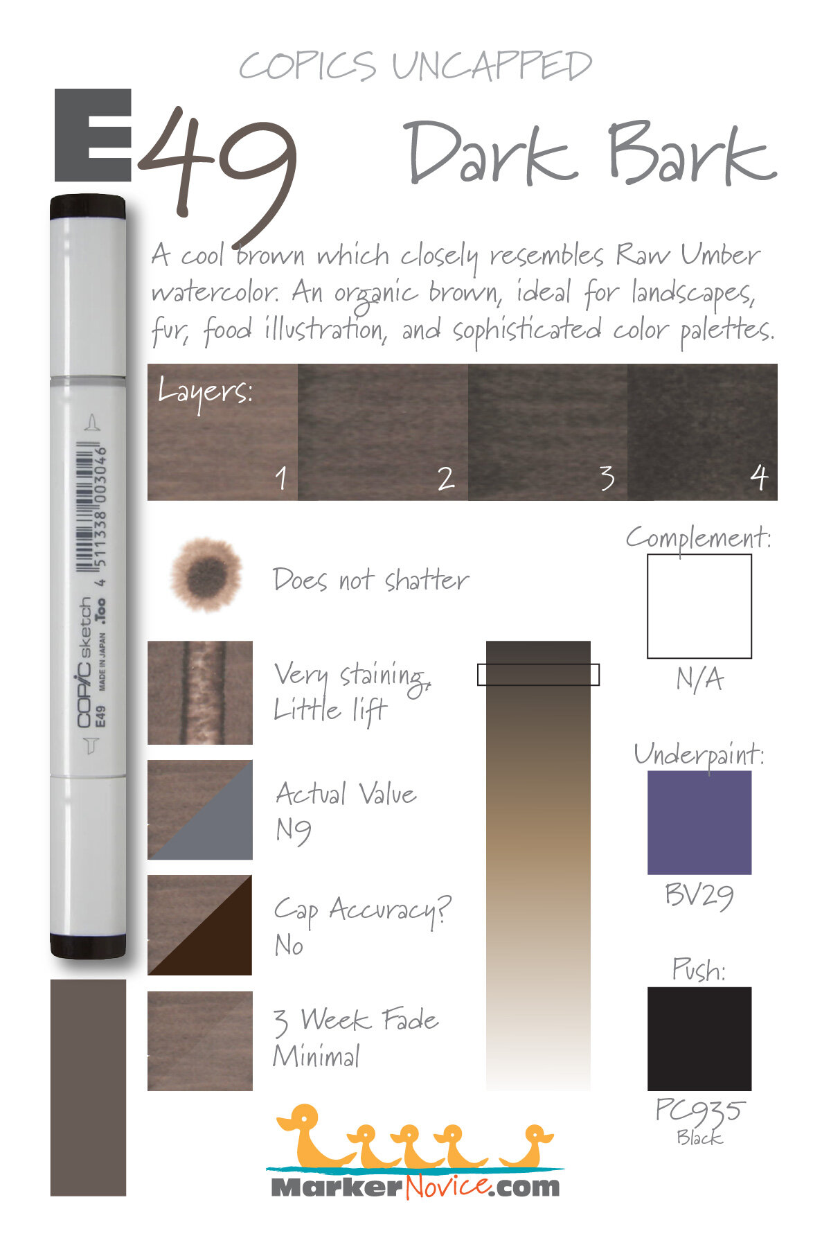
E49 Dark Bark is a cool brown Copic Marker which closely resembles Raw Umber watercolor. An organic brown, ideal for landscapes, fur, and food illustration. E49 is available in Copic Sketch, Ciao, and Classic marker styles.
Every Copic Marker has unique characteristics based on its unique ink formula.
Knowing how a color behaves will help you blend effectively and make art with confidence.
E49 Dark Bark
Let’s take a closer look at this Copic Marker and its ink characteristics.
Temperature: A cool brown
Resemblance: Raw Umber Watercolor
Actual Value: N9
All Copics are measured on a Neutral Gray value scale. The last number on the cap is supposed to indicate value but we’ve found discrepancies where the actual ink value is different than cap designation.
Cap Accuracy: The plastic on a Sketch marker matches 4-5 coats of E49 ink. It’s the correct color family, but misleading because you expect the ink to be as dark as the cap.
Buildup: E49 layers well but exercise caution at more than 2 coats of ink.
Shattering: Does not shatter.
Chromatography testing shows this ink’s behavior when it comes in contact with #0 Colorless Blender (solvent). High shattering colors may leak unexpected color when you make corrections or attempt to blend with any color that has a high solvent to colorant ratio. Shattering is not bad, it’s just something to be aware of.
Staining: Very staining.
Lift: This color does not lift much.
See staining swatch. Sample was given 6 stripes of #0 Colorless Blender, drying between each stripe. Results indicate how much lifting you can expect.
Lightfast: We observed very minimal fading during the test period, less than 10%.
Samples were swatched on X-Press It Blending Card. 1 layer of ink was exposed to windowsill sunlight for 21 days. Approximately 10 hours of sun per day based on weather conditions. Note: we do not recommend displaying original Copic art under these conditions.
Natural Ink Family: E49 is the dark end of the very large E-Forty family. We recommend that beginners purchase both warm and cool brown blending combinations. We highly recommend the E40s are highly recommended as your cool brown.
Family Members: E40, E41, E42, E43, E44, E47, E49
We include this information because many Copic users never think deeper than the letter groupings (R, BV, G, etc.). Every ink has its own temperature variations and underlying flavors. Understanding what an ink looks like in its different dilutions helps when creating your own blending combinations.
Complement: Brown is not a hue on the color wheel and does not have a complement.
Underpaint: BV29 neutralizes this color well.
This is simply one suggestion. Many possible colors exist. Test to find a color that pleases you.
Pushing Pencil: Prismacolor 935 Black pushes this color but exercise caution. Black is really the only color dark enough to push E49 but it’s not a great match.
VanillaArts.com (our sister site) teaches a Push & Pull technique for dimensional coloring. This is simply one suggestion. Many possible colors exist. Test to find a color that pleases you.
Vanilla Arts Classes using E49:
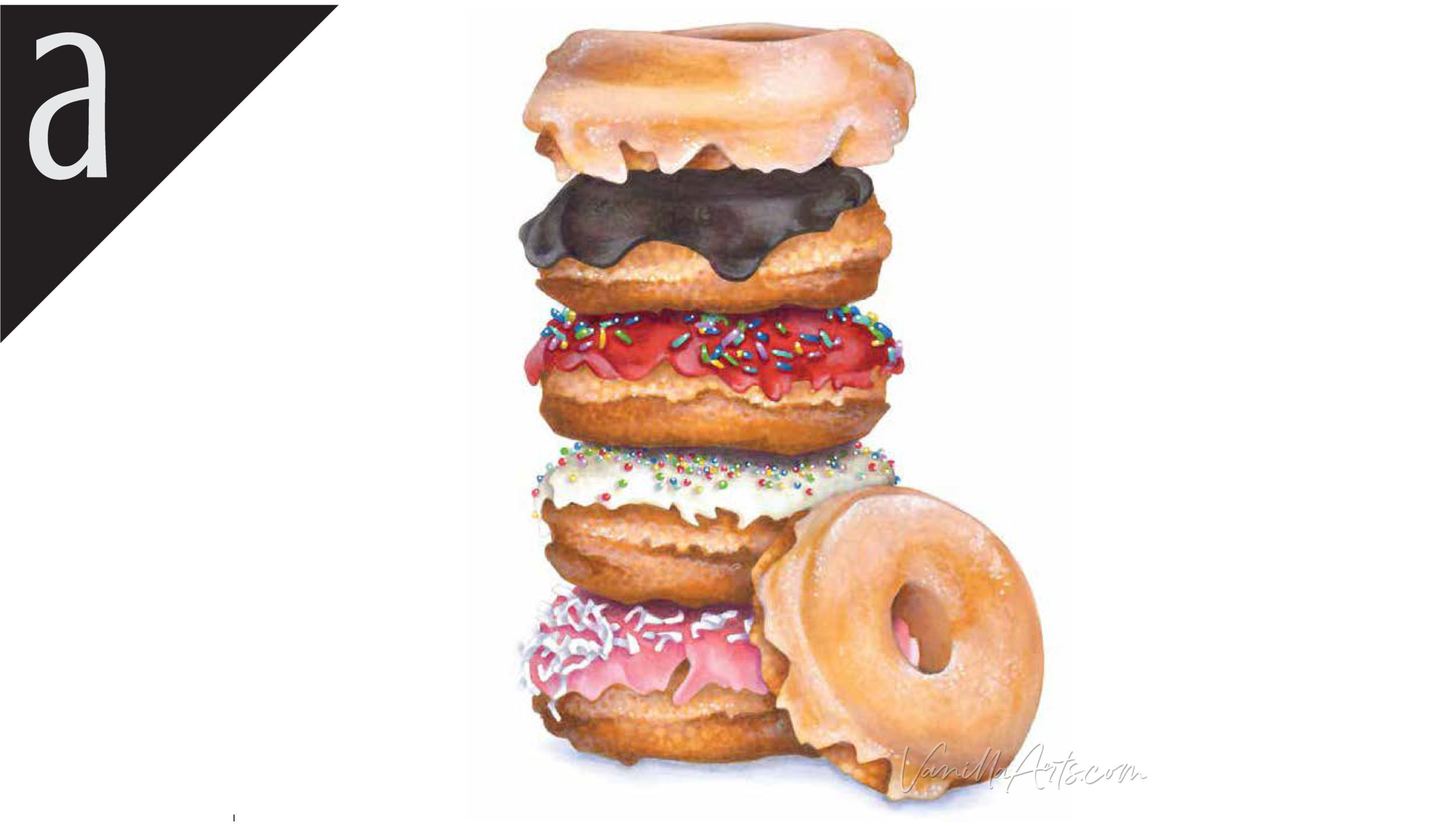
Doughnut Stack: Amy shows you why underpainting provides the basis for realistic coloring with accuracy. Find more info here.
Vanilla Arts Digi Stamps using E49:
We continue to create new digi stamps and we will update here as more become available.
Visit the stamp shop at our sister site VanillaArts.com for a wide variety of versatile digi stamps.
Color palettes and swatches using E49:
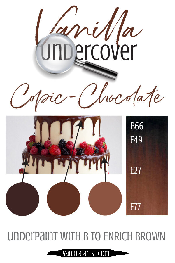
Looking for beautiful color palettes?
We absolutely love The Color Catalog 1 & 2 from Sarah Renae Clark. It puts hundreds of Copic friendly color palettes at your fingertips.
(note: affiliate link)